Tutorials
Claude Opus 5.5 responsive image audit: fix blurry product images
Use Claude Opus 5.5 to compare the image slot, candidate files and browser request before exporting a larger product photo.
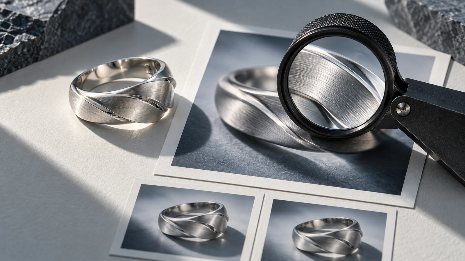
Use Claude Opus 5.5 to compare the image slot, candidate files and browser request before exporting a larger product photo. A blurry hero can come from the wrong resource being selected, while a heavy mobile download can come from an overstated slot. Give the model measurements, not only a screenshot.
Choose the repair from the evidence
| Observation | Inspect first | Smallest useful repair |
|---|---|---|
| Sharp original, soft page | Rendered width, DPR and requested file | Correct the candidate set or slot declaration |
| Mobile downloads the largest file | `sizes`, CSS layout and `currentSrc` | Align the declared slot with the actual layout |
| Product is cut off | Crop and `object-fit` | Fix composition or art direction |
| Correct file still looks damaged | Actual source pixels and encoding | Re-export from the original |
MDN explains responsive images, including the distinction between resolution switching and art direction. `sizes` helps describe the slot; it does not set the CSS width. Use `picture` when different crops are intentional. Do not ask Opus to solve a cropped handle by increasing JPEG quality.
A worked resource budget
Consider a hypothetical cup page with a 390 CSS-pixel viewport and 24-pixel padding on each side. The image slot is 390 − 48 = 342 CSS pixels. At DPR 2, a useful starting resource width is 342 × 2 = 684 pixels. With 480, 800 and 1200-pixel candidates, 800 is a plausible choice, not a guaranteed browser decision. These are calculated example values, not an Opus benchmark.
If the markup says `sizes="100vw"`, it describes 390 rather than 342 pixels at this width. That mismatch is about 14% of the real slot. It does not necessarily change the selected candidate, but it becomes important near candidate boundaries. On desktop, a half-width card should not inherit a full-viewport declaration just because the mobile hero does.
Record the viewport, zoom, `devicePixelRatio`, element rectangle, `currentSrc`, response dimensions and transferred bytes. In the network panel, inspect the actual requested image with cache conditions recorded. A wider candidate may remain cached after resizing, so one resize is not proof that the rules are wrong. The web.dev guide describes letting the browser select an appropriate resource.
A complete review prompt
Review this product-image resource selection. Inputs: HTML or component code, relevant CSS, candidate filenames with actual pixel dimensions, viewport and DPR, the rendered image rectangle, currentSrc and network transfer size. Treat absent measurements as unknown.

Separate resolution selection, art-direction cropping and compression damage. Calculate slot width × DPR for the supplied conditions and compare it with the requested file. Check that each width descriptor matches the actual asset. Explain whether sizes matches the CSS layout at each supplied breakpoint. Do not promise a particular browser choice from markup alone.

Return: an evidence table, the most likely cause with uncertainty, the smallest code change, and a verification matrix for narrow and wide screens at DPR 1 and 2. Preserve product framing, alt text and the existing component API. If the evidence is insufficient, name the next measurement instead of rewriting the whole image system.
This prompt follows the practical approach of supplying context and explicit output requirements in the official Opus guide. The proposed workflow is illustrative; no model run is claimed here.
Verify the image that customers receive
Repeat the same product at the recorded widths, then inspect fine edges at normal viewing size. Check the requested file and bytes as well as appearance. Keep width and height or another reliable aspect-ratio reservation so the layout does not jump while loading. Accept the change when framing stays correct and the browser has suitable candidates without unnecessarily forcing the largest original on every screen.
Common questions
**Should every source be twice the displayed width?** DPR 2 is one test condition, not a universal export rule. Layout, candidate spacing and browser choices still matter.
**Will more compression fix a wrong `sizes` value?** It may reduce bytes while leaving the selection error intact. Fix the slot evidence first.
**Can a screenshot prove which resource loaded?** No. Pair it with `currentSrc` and the network response; two differently sized resources can look similar in a small capture.
Take the checked asset into the campaign
Keep the approved product image and the selected crop together before creating campaign variations in Panelly Studio. Use product-photo reflection and perspective checks when the object itself looks wrong. Panelly is the creative handoff here; this does not describe an Opus integration.