Tutorials
Claude Opus 5.5: Repair Small Touch Targets on Product Pages
Ask Claude Opus 5.5 to inspect the clickable area of each product-page control, not merely the size of its icon.
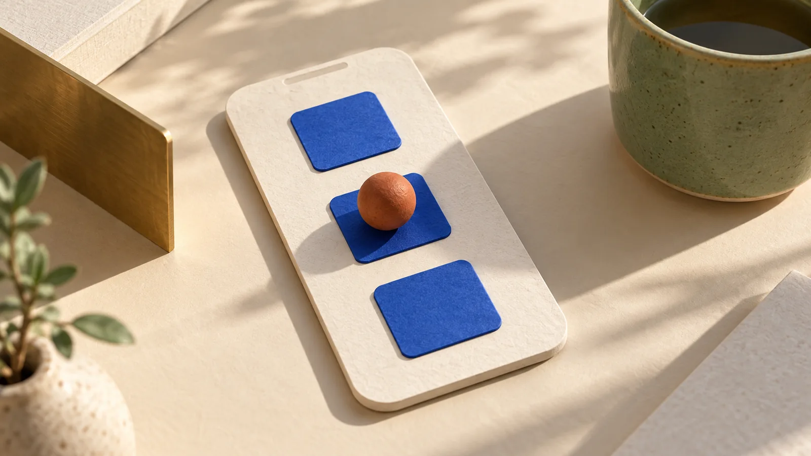
Ask Claude Opus 5.5 to inspect the clickable area of each product-page control, not merely the size of its icon. A larger visible symbol can still sit inside an undersized button; invisible padding can collide with a neighboring action. The useful output is a measured repair and a short interaction test.
Measure the control that receives the tap
Provide the rendered page, component CSS, viewport dimensions and a list of controls: quantity minus/plus, variant swatches, gallery arrows and dismiss buttons. Record bounding rectangles in CSS pixels. A screenshot helps explain the layout, but it does not reveal which element receives a pointer event.
A 2012 UX discussion about target spacing distinguishes large controls from closely adjacent conflicting actions. It is historical community discussion, not a measurement of today's store. The current W3C target-size explanation describes a 24 × 24 CSS-pixel minimum with defined exceptions, including a spacing test for undersized targets. This is not a universal requirement for every inline text link.
| Finding | Repair candidate | Verify afterward |
|---|---|---|
| Small icon inside small button | Increase the button box | Edge taps trigger the intended action |
| Spacious appearance but overlapping hit areas | Remove overlap; use layout gap | Gap does not activate either neighbor |
| Wide button with short height | Add vertical space | Both dimensions meet your design target |
| Swatch only identified by color | Supply a meaningful accessible name | Keyboard and assistive labels remain useful |
Work a quantity-control example
Suppose two square buttons are each 20 pixels wide with a 2-pixel gap. Their centers are 22 pixels apart. Two 24-pixel-diameter circles centered on those targets overlap, so that particular spacing arrangement does not qualify for the spacing exception. These are calculated dimensions for a hypothetical layout, not a live accessibility audit.
For this example, choose square 44 × 44 button boxes with an 8-pixel gap as a roomier design decision. Two buttons consume 96 pixels before the quantity display. If the display is 40 pixels wide and there are two 8-pixel gaps, the complete minus/display/plus row consumes 144 pixels. Budget the entire row before compressing the buttons again.
.quantity-button {
  min-inline-size: 44px;
  min-block-size: 44px;
  display: inline-grid;
  place-items: center;
}
.quantity-controls {
  display: inline-flex;
  align-items: center;
  gap: 8px;
}
This CSS is a starting point, not a certification. Borders, shapes, transforms and overlapping elements affect the actual target. Keep the icon smaller if that preserves visual balance. Avoid solving the problem with overlapping pseudo-elements that make adjacent actions ambiguous.
A complete Opus repair prompt
Review touch targets in the supplied product-page component at 390 and 1280 CSS-pixel viewport widths. Inputs: rendered page, source CSS, DOM and quantity/variant/gallery controls. If browser access is unavailable, separate estimated sizes from measured results.
List each control's accessible name, actual hit area, neighboring gap and observed overlap. Distinguish the W3C 24 × 24 minimum and its exceptions from our chosen 44 × 44 square-button design target. Do not label the whole site compliant based on this review.
Propose the smallest layout patch. Preserve prices, selected variant, quantity boundaries, focus indicators and responsive behavior. Keep visual icon size separate from button size. Do not create overlapping invisible targets.
Test center and edge taps, the gap between neighbors, keyboard focus, repeated quantity changes and the disabled minimum state. Record what ran and what remains untested. Return measurements, patch and before/after interaction results.
This is a proposed use of Opus, consistent with providing a bounded task and explicit acceptance conditions in the official prompting guide. It is not a model test. Use real pointer interactions after applying a patch; a DOM rectangle alone cannot detect a transparent overlay intercepting events.
Questions before shipping
**Does a 44-pixel icon solve it?** Only if the actual control is large enough and receives the tap. Inspect both the icon and its button.
**Should every target get the same gap?** No. This article's 8-pixel gap is an example layout choice. Check the applicable criterion and neighboring actions rather than treating it as a universal standard.
**What about the close button in a dialog?** Target size and dialog focus restoration solve different problems; validate both.
Bring an approved product image into Panelly Studio to create the campaign creative, then review the real landing-page controls separately. An attractive CTA drawn inside an image is not automatically an interactive button, and Panelly is not claimed to integrate Opus.