Campaigns
Ad-to-Landing-Page Message Match: A Product Campaign Checklist
Make the product, promise, offer and next step agree from your ad to its landing page. Includes an original mismatch audit and a four-panel campaign example.
Ad-to-landing-page message match means that someone who clicks your ad finds the product, promise and next step they expected. Check the exact variant, commercial offer, main benefit and destination action together. Repeating a headline helps only when the page also delivers what the ad implies. A matching color palette cannot repair a different product or an unavailable offer.
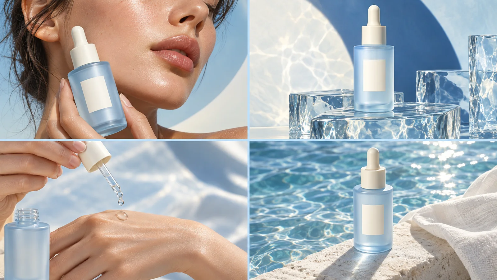
For a four-panel ad, the final frame often makes the promise most explicit. Read that frame beside the first screen of the destination before you launch. You are checking one continuous customer journey, even though the creative and page may have been made separately.
Audit four things before polishing the design
Unbounce defines message match around the relationship between an ad's wording and the landing-page message. For product campaigns, use the following practical audit to include what the pictures imply as well.
| Check | In the ad | At the destination | A mismatch to fix |
|---|---|---|---|
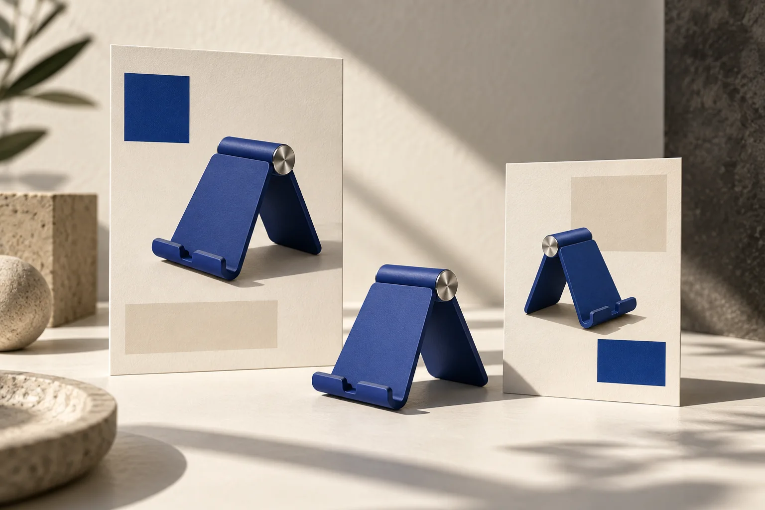
| Product | Navy folding phone stand | The same stand and selectable variant | The link opens an unrelated accessories collection |
| Promise | Holds a phone upright on a desk | The page explains and shows that use | The first screen promotes travel storage instead |
| Offer | A single stand with no discount claim | The same purchase terms | The image implies a two-pack but the page sells one |
| Action | Explore the stand | A relevant product page | The destination asks visitors to join a generic newsletter |
This is an editorial example for a fictional product. The stand's features, offer and page must be replaced with your real facts before using the structure.
Start with the destination you can actually support
Open the exact URL that will receive the click. Record the product title, selected variant, current availability, offer and visible next action. Then write a one-sentence promise that the page can fulfill.
For the example stand: “A folding stand that keeps your phone upright while you work at your desk.” That sentence gives the ad a useful direction without adding a charging function, ergonomic outcome or universal device compatibility.
A campaign can focus on one benefit even when the product page covers many. Make that benefit easy to find at the destination. If the ad focuses on folding storage but the page opens with a generic brand manifesto, the connection requires more work from the visitor.
Build the four frames around the same promise
Here is an original structure you can adapt in Panelly Studio:
Create a four-panel ad for the navy folding phone stand in my reference.
The destination is its product detail page. The main idea is keeping a phone upright on a working desk.
First: a desk with a phone lying beside a notebook, introducing the everyday situation.
Second: the phone sits upright in the stand, clearly showing the support.
Third: a close-up shows how the same stand folds for storage.
Fourth: the product alone with “A place for your phone” and “Explore the stand.”
Keep the navy finish and silver hinge consistent. Do not add a discount, charger or extra included accessories.
The prompt describes a complete ad, including its wording. You do not need a separate CTA layer to establish message match. After generation, check the actual picture and copy: an unintended second stand or a charging symbol can change what the ad communicates.
Fix mismatches in the right place
If the product or offer in the image is wrong, revise the creative. If the ad is accurate but the destination hides its central benefit, improve the page or choose a more relevant existing URL. If the offer cannot be fulfilled, changing only the landing-page headline is not enough.
Google Ads' landing-page guidance asks advertisers to align the destination with the ad and its call to action. Its discussion of Quality Score concerns Google Ads; it does not establish a score or ranking rule for another platform.
Avoid creating a new landing page for every minor artistic variation. Two ads with the same product and promise can use one suitable page. A materially different audience problem or offer may need a different section or destination. Let the actual customer expectation determine the change.
Use visual continuity as a recognition cue
Repeat enough of the campaign's visual identity that the visitor recognizes the product: the same finish, packaging version and distinctive detail. You can reuse the product angle or a related crop without making the entire landing page look like an advertisement.
For the fictional stand, the ad could use warm afternoon light while the product page uses a neutral studio photograph. Those images can still connect if the stand is unmistakably the same. A beautiful match in background color is less helpful if the hinge, included quantity or variant changes.
Inspect the mobile first screen. A matched headline that is buried below a tall decorative banner may not provide an immediate connection. Keep the advertised product and its next step easy to locate.
Interpret the data after the handoff is correct
A page with few purchases does not prove that message match is the problem. Loading issues, stock, price, targeting, tracking and the offer itself can also matter. Check that the destination works before treating the result as a creative judgment.
If you change both the headline and the product offer, record both changes. Otherwise, later results may be attributed to the wording when the commercial terms also moved. For a controlled comparison, use the small-batch creative testing guide and decide what question the test is meant to answer.
Keep a campaign note with the final image, destination URL and launch terms. Review it when the page or promotion changes so an older ad does not keep sending people to an experience that no longer matches.
FAQ
Must the ad and page use exactly the same headline?
No. They should communicate the same relevant promise clearly. A short ad line and a fuller product-page explanation can work together without being word-for-word identical.
Can I send a product ad to the homepage?
Only if that page makes the advertised product and intended next step easy to find. A broad homepage often requires more searching than a relevant product page, so inspect the actual experience.
Does message match guarantee better conversion?
No. It removes a possible source of confusion. Measure the campaign's intended outcome and consider the other factors in the journey before attributing a change to the creative.