Tutorials
Claude Opus 5.5: Diagnose Product Emails That Break in Dark Mode
Use Claude Opus 5.5 to compare the same email in light and dark inboxes, identify which asset or style fails, and propose a small repair.
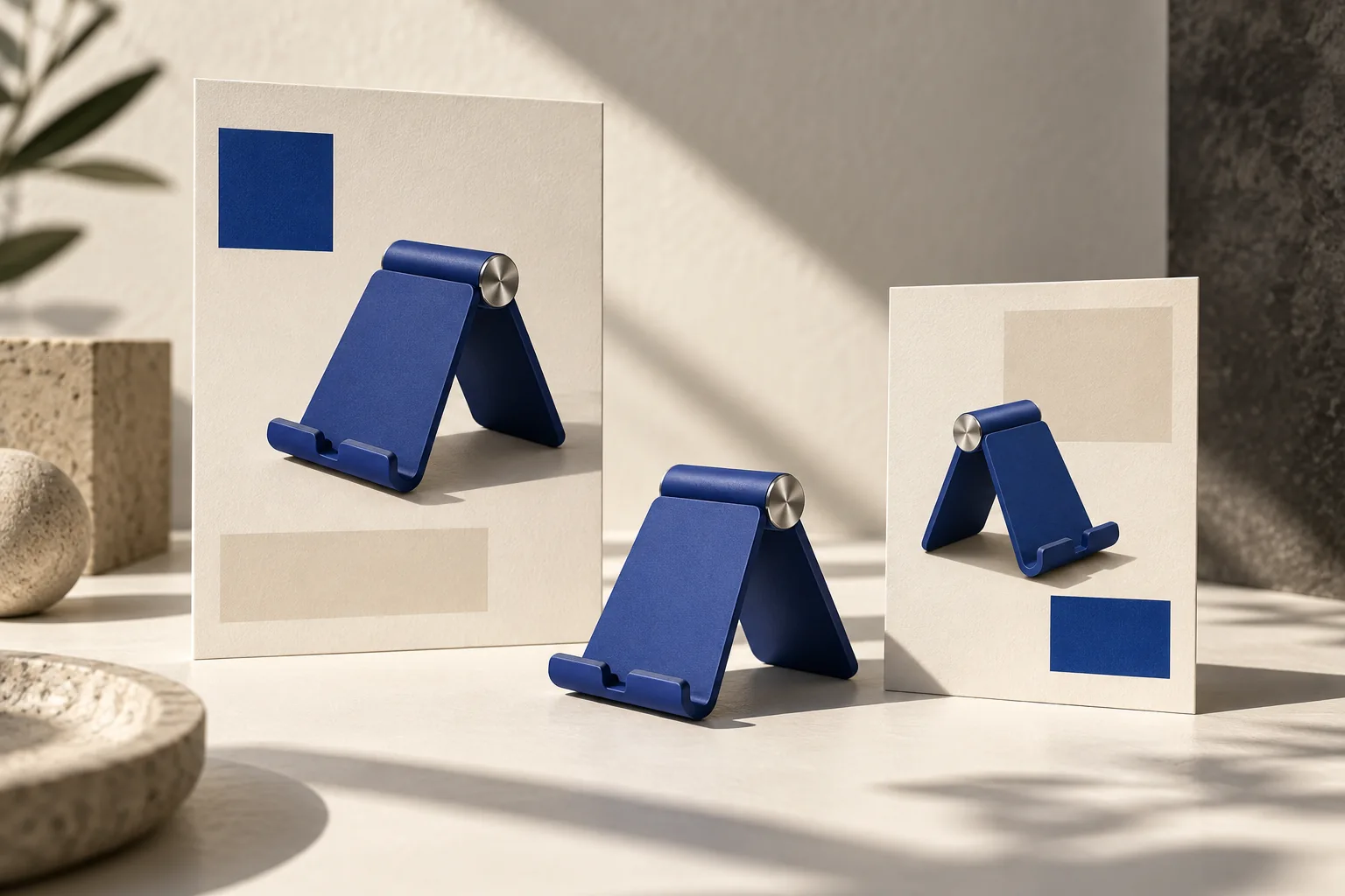
Use Claude Opus 5.5 to compare the same email in light and dark inboxes, identify which asset or style fails, and propose a small repair. Supply the HTML, logo files and actual inbox screenshots. A browser preview is useful for layout but cannot certify email-client behavior. Start with a readable product, offer and action button, then refine the decoration.
Classify the failure before editing the template
Dark-mode problems can come from different layers. Keep the original email so that each change has a clear before-and-after comparison.
| What disappears | Likely place to inspect | What to try first |
|---|---|---|
| Dark letters inside a logo | The image’s transparent pixels | An approved logo treatment that remains visible on both backgrounds |
| Button text | Text and background colors in the received email | Repair that button’s foreground/background pairing |
| Product edge | The product image and adjacent background | Test a contained image treatment without recoloring the product |
| Whole message with images blocked | Information stored only in images | Keep the offer and destination understandable in live text |
Litmus’s dark-mode guide documents differing inbox transformations and logo treatments. Do not turn one successful CSS change into a promise that every inbox will behave identically. The useful output is a patch plus a named test matrix.
Build a small, repeatable inbox comparison
For a hypothetical bottle launch, prepare four screenshots: the same message in two important recipient clients, each in light and dark mode. Record client, operating system, version if available, message revision and whether images were loaded. Compare the received message after sending through your actual email platform, since that platform may transform markup.
Suppose the bottle stays readable but the dark wordmark vanishes. Request two brand-approved candidates: a subtle light keyline or a contained logo background. Compare both at the real display size. If a 320-pixel-wide source is displayed at 160 pixels, a 2-pixel source outline appears about 1 CSS pixel wide. Judge the result at 160 pixels, not while zoomed into the source file. These are illustrative dimensions, not a universal logo specification.
Keep the product photograph unchanged during this test. If you change logo, photograph and button simultaneously, a second failure becomes harder to locate. Save candidate A and B separately and use the same message content for both.
A prompt that asks for evidence, not a universal hack
Compare [email revision], [HTML file], [logo files] and these received-email screenshots: [client/version/mode for each].
The product colors, approved logo proportions, offer wording and destination URL must stay unchanged.
For each screenshot, identify unreadable elements and separate image-pixel problems from HTML/CSS color problems. Describe visible evidence; do not infer unsupported client behavior.
Propose the smallest repair for each defect. For the logo, compare a brand-approved outline with a contained background. Do not redraw the brand mark.
Return a change list, any HTML patch, required asset variants and a test matrix covering both modes in the supplied clients. Keep the offer and button understandable when images are blocked.
If you can render or send a test through authorized tools, report exactly which checks ran. Otherwise label the result untested and tell me which received-email screenshots to compare next. Do not claim compatibility from a browser preview.
Use the next reply to address one failed row of the matrix. For example: “Candidate B passes the logo check but the button label vanishes in screenshot 4; change only that button.” This keeps the diagnosis tied to a visible defect instead of restarting the entire design.
What counts as acceptance?
The reader should recognize the brand, identify the product and find the action in every tested configuration. Check the destination by opening the button, and check the blocked-image state separately. Keep a record of untested clients rather than marking them as passed. A logo that looks acceptable on a black artboard may still fail after the email platform transforms the message.
A May 2026 community question asks how to preserve a red-and-blue logo in dark mode. That is a real design constraint, not evidence that the proposed treatment has been tested on your campaign. The examples here are hypothetical, not an Opus evaluation.
Questions before the next send
Should I put the entire email in one image?
That hides the offer when images are blocked and makes text changes harder. A complete promotional image can still be useful, but keep essential email information available outside it.
Can Opus fix the logo file itself?
Whether a file is edited depends on the tools available in your environment. Ask for the actual revised file and inspect it; a verbal recommendation is not an edited asset.
Where does Panelly fit?
Use Panelly Studio for the promotional product image and chat-led visual revisions. Email HTML, sending and inbox testing remain separate steps; this workflow does not imply an Opus integration. For descriptive image text, use the product alt-text guide.