Tutorials
Claude Opus 5.5 for Landing Pages: Improve Design Without Losing the Sale
Revise a landing page with Opus 5.5 while preserving product selection, checkout and analytics. Includes a complete prompt and four-state mobile review.
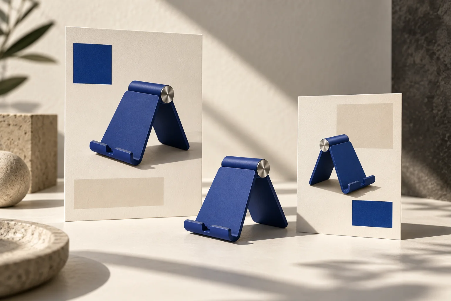
Give Opus 5.5 a specific landing-page revision, the ad visitors arrive from and a short list of behaviors that must survive. Start with the first screen on mobile, then inspect the real purchase path. A cleaner hero is useful only if shoppers can still select the advertised product and reach the right destination.
Cursor's model guide identifies front-end and UI work as an Opus 5.5 strength. That makes it a candidate for this workflow, not proof that every generated page will convert better. The exercise below is a proposed brief and review method, not a measured conversion study.
Pick one problem visible in the current page
Imagine a fictional blue phone-stand campaign whose ad promises a simple setup for small tables. The landing page opens with a large abstract animation, hides the product below the fold and defaults to a different color. The first revision should restore the product and the promise, rather than add another decorative effect.
Save the current page and a record of its working interactions. Give the model the actual source files when you want code changes. A screenshot helps explain visual hierarchy but does not contain checkout logic, inventory state or analytics events.
| Keep | Change | Verify |
|---|---|---|
| Product identifiers and existing destination | Bring the blue stand into the hero | CTA opens the intended product |
| Variant selection behavior | Make the advertised color obvious | Selection persists through the purchase path |
| Existing event names | Simplify the first-screen hierarchy | One click records one intended event |
| Error and unavailable states | Improve spacing and readability | Unavailable products cannot appear purchasable |
This is a change contract. If a behavior is missing from the supplied project, ask the model to identify the gap rather than claim to preserve an implementation it cannot see.
Use a complete revision prompt
Revise the attached landing page for our fictional blue phone stand. Visitors arrive from an ad about a simple setup for small kitchen tables. Keep the existing product identifiers, variant selection, checkout destination and analytics event names.
At 390 px width, make the product, one approved benefit and the primary CTA easy to find. Use the supplied product image, restrained typography and comfortable spacing. Remove the distracting hero animation if it competes with the product. Do not invent reviews, discounts, delivery times or capabilities.
Before editing, list the files and behaviors involved. Change only this page and directly required styles. Preserve unavailable, loading and error states. Return the patch, a mobile preview and the checks actually run. If you cannot inspect the browser or checkout integration, say what remains unverified.
Attach the ad and page screenshot with explicit roles: one establishes the campaign promise, the other shows the current interface. Otherwise the model may copy the ad's complete composition into a web page where text wrapping and touch interaction need different treatment.
Review four states, not one screenshot
First inspect the page at 390 px with the normal product available. Read the headline aloud and compare it with the ad: does it promise the same benefit? Check whether the product color matches the selected variant, rather than merely the decorative image.
Then test a longer localized headline. The button should remain readable without pushing content outside the viewport. A useful acceptance rule for this exercise is no horizontal page scrolling; the exact layout may still change between languages.
Next simulate the existing unavailable state. A disabled purchase action needs a clear explanation. Finally trigger the existing error path and confirm that retry keeps the user's selection. These checks reveal regressions that a polished screenshot can conceal.
For analytics, inspect the event stream or development instrumentation you already use. Do not invent a tracking implementation just to report a pass. If the original integration is not available in the test environment, record the gap and verify it before release.
Send feedback as a local change
Instead of “make it more premium,” say: “Keep the product position and type scale. Reduce the empty space above the CTA by one spacing step. Preserve the selected blue variant and the existing button handler.” Compare the changed region with the saved baseline, then repeat the relevant interaction checks.
Use the original Astra landing-page workflow when building from a blank brief. Use this revision contract when a functioning page already exists. In Panelly Studio, create or refine the matching complete ad image, including its headline and CTA if desired; then use that approved image as campaign context for the page work. Panelly is not being presented here as a website builder or an Opus 5.5 integration.
FAQ
Should the ad and page look identical?
They should agree on the product, promise and offer. Their layouts can differ because a static image and an interactive mobile page have different jobs.
Can I judge success immediately after shipping?
You can check functionality immediately. Conversion changes require comparable traffic and a sufficient observation window; a prettier page alone does not establish lift.