Tutorials
Claude Opus 5.5: Fix a Product Comparison Table on Mobile
Ask Claude Opus 5.5 to preserve the comparison task when repairing a mobile table, rather than merely shrinking it to fit.
Ask Claude Opus 5.5 to preserve the comparison task when repairing a mobile table, rather than merely shrinking it to fit. Buyers need to connect each value to its product and feature. A compact layout that hides the model name or turns every missing value into “No” changes the meaning of the comparison.
This is a proposed design-review workflow with a fictional product example. Supply the actual data, current HTML/CSS, target viewport and buyer question. It is distinct from extracting specifications: first approve the facts, then decide how readers can compare them on a small screen.
Choose the mobile pattern by the reader's task
A mobile-table discussion captures the tradeoff between horizontal scrolling, fewer columns and separate cards. Those are design options, not proof that one pattern improves sales. Ask which two products the buyer needs to compare and which attributes decide the purchase.
| Reader task | Candidate layout | Check before approval |
|---|---|---|
| Compare the same feature across products | Scrollable semantic table | Row and product identities stay clear |
| Compare two selected products | Two-product selector | Selection changes preserve row meanings |
| Learn about one product at a time | Labelled feature cards | Every value keeps its feature label |
| Find a specific difference | Optional differences filter | Unknown values are not treated as equal |
Start with the simplest pattern that supports the task. A selector adds state and keyboard work; cards can make cross-product comparison slower. Avoid maintaining independent desktop and mobile facts, because one version will eventually drift.
Use a small fixture that exposes mistakes
Suppose fictional lamps A and B have weights 410 g and 560 g. A has USB-C charging; B's source does not specify charging. Both have three brightness settings. A useful comparison keeps the weight difference visible and labels B's charging information “Not specified.” It cannot conclude that B lacks USB-C.
With a differences-only filter, the equal brightness row may disappear, but the uncertain charging row remains. Add a third product with a long localized name and a footnote to the fixture. That catches overflow and association errors that two short English names will miss. The sample describes required behavior; it is not a measured Opus result.
For simple row-and-column tables, W3C's guidance uses header cells and `scope` to identify relationships, with a caption to identify the table. Retain those associations when changing the visual layout. A pretty screenshot cannot show what a screen reader announces.
A prompt with concrete acceptance criteria
The official Opus prompting guide is useful for specifying the requested patch and checks. Give the model the data source and keep factual changes outside the layout task.
Repair this product comparison at a 390 CSS-pixel viewport.
Buyer task: compare weight and charging for two selected lamps.
Use one approved data source for desktop and mobile; do not invent missing values.
Fixture: A weighs 410 g and supports USB-C; B weighs 560 g and charging is not specified. Both have three brightness settings.
Propose the simplest suitable layout, then a minimal HTML/CSS patch.
Keep product names and row labels associated with every value. Preserve caption and semantic header relationships.
If using horizontal scrolling, confine it to the table region and provide a visible cue and usable keyboard access.
If using a selector, label it and preserve focus when selection changes.
Test long localized names, text enlargement, keyboard navigation and unknown values in a differences filter.
Return executed checks separately from checks you could not run. Do not claim accessibility from a screenshot alone.
Verify more than the first screenful
At the target width, move through every column or selector option. Ensure a sticky label does not cover data and that long units or footnotes remain attached to the correct feature. Increase text size and check the containing page for unintended horizontal overflow. A scrollable table region can be intentional; an entire page sliding sideways usually is not.
Use keyboard navigation and the target screen reader to confirm headers and controls are understandable. Check the no-script fallback if the design depends on a selector. Record which checks were actually executed. Remove an interaction if its maintenance cost exceeds the small table's needs.
Keep comparison imagery consistent
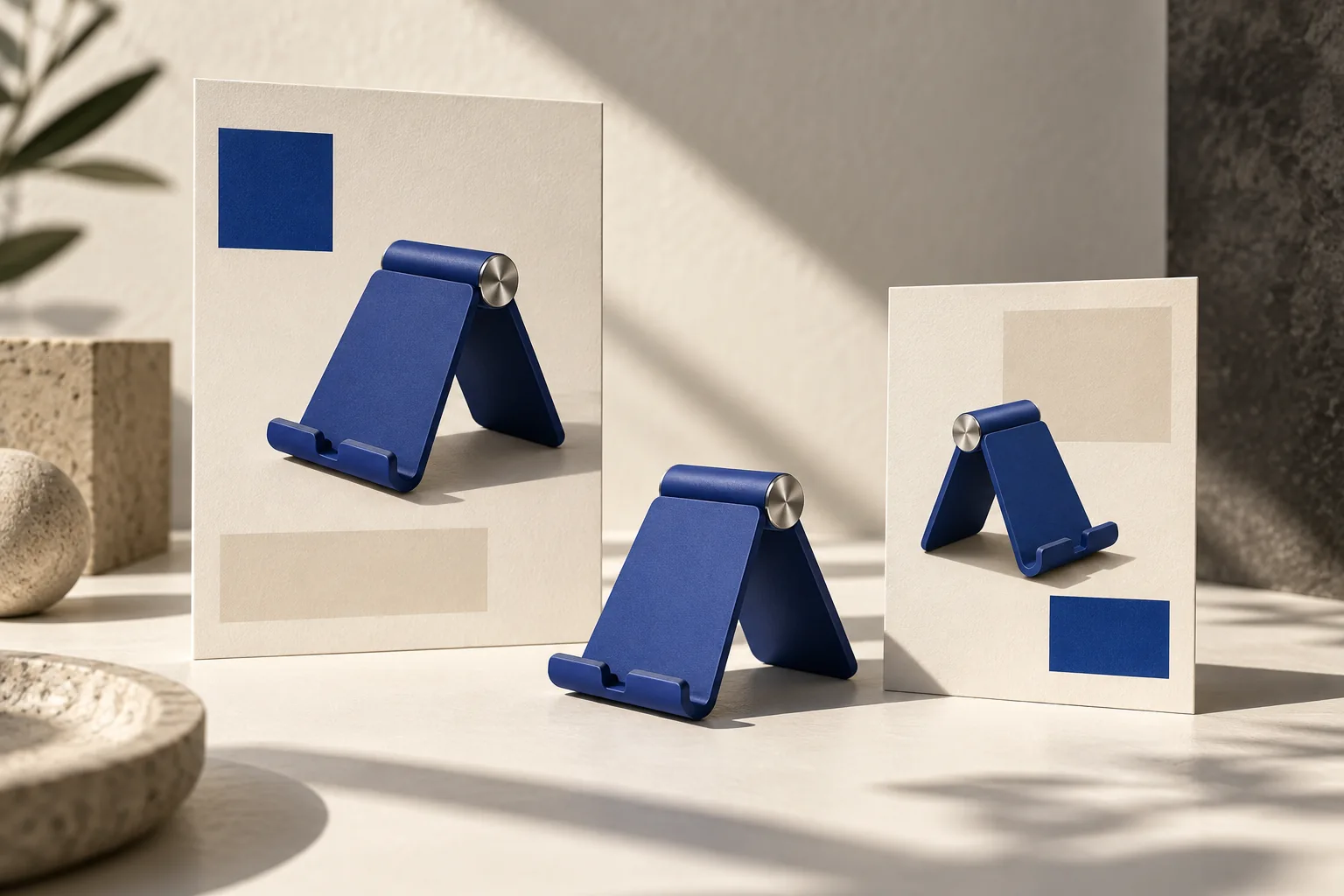
Create matching product visuals in Panelly Studio so both products use comparable camera angles and scale. Keep the comparison facts as real text in the page rather than only inside an image. Panelly is not claimed to generate or certify the table implementation. Use the PDF specification workflow to verify inputs and landing-page revisions for broader structure.
Can I remove all identical rows?
Make that an explicit, reversible reader option when appropriate. Identical features can still matter to a buying decision, and missing information is not evidence of equality. Show how to restore the full comparison.