Tutorials
GPT-6 Astra for Web Design: From a Product Brief to a Working Landing Page
Give GPT-6 Astra a useful web-design brief, then inspect the visual system, mobile layout, working controls and revisions before using the page with an ad campaign.
Use GPT-6 Astra for web design by assigning a complete page with a clear commercial job, a small visual system and observable interactions. Ask it to build and inspect the page at desktop and mobile widths, then revise specific defects. A screenshot can establish a direction; the delivered website must also work when someone clicks, types, scrolls or returns to it.
OpenAI's website showcase includes storefronts, landing pages and interactive experiences. It is useful evidence of possible outputs, not a guarantee that every first prompt produces a finished site. This guide supplies an original workflow and fictional storefront brief rather than presenting an unrun experiment as a review.
Define what the visitor should do
For a product page, the main question is often whether a visitor understands the product and can reach its purchase information. Choose that action before listing fashionable effects.
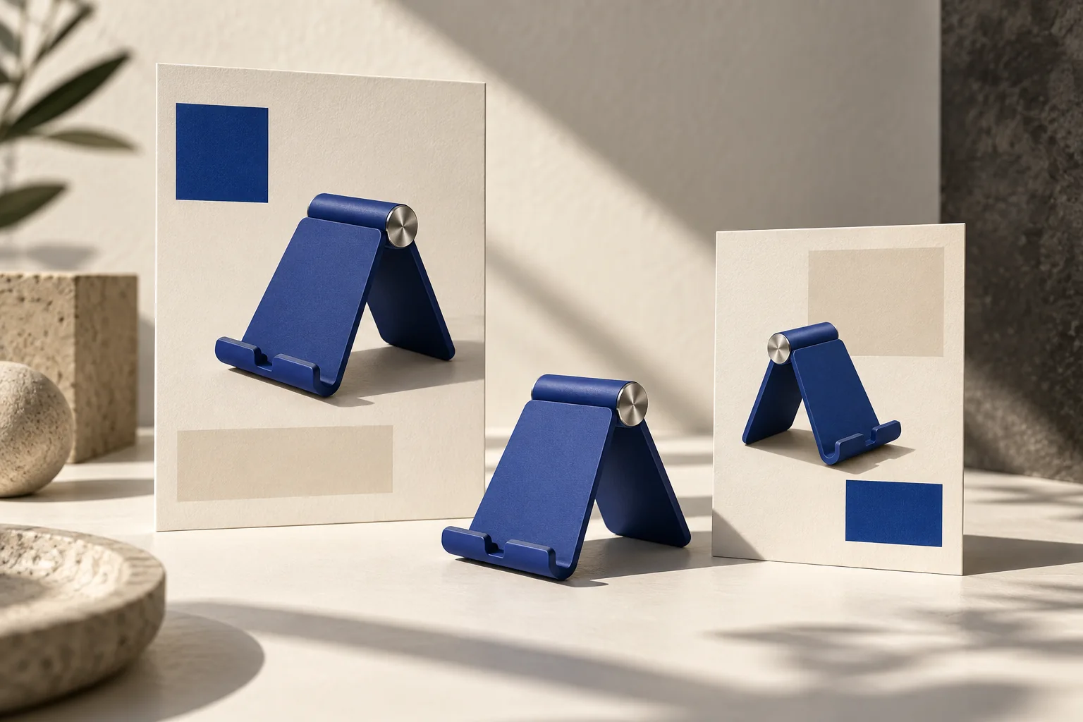
Imagine a fictional adjustable phone stand called Angle. The supplied facts are a folding body, an adjustable viewing angle and a cobalt-blue finish. Its landing page should explain those features and link to a real product-details destination provided by the owner. No sales counts, customer reviews or delivery promises are available.
| Page element | Job in this example | Evidence of completion |
|---|---|---|
| Hero | Identify the stand and its main use | Product and next action are clear at phone width |
| Product detail | Show how the adjustment works | Image and copy describe the same mechanism |
| Context section | Show a desk use case | The stand remains recognizable |
| Main action | Reach the product details | The link resolves to the supplied destination |
| Mobile navigation | Reach the same sections | Open, close and keyboard behavior work |
Give it a visual language, not a pile of references
Specify a few decisions that can remain consistent: a warm off-white canvas, cobalt product imagery, charcoal text, a serif headline and a restrained sans-serif for controls. Then state how they work together. For example, large product views lead the page; fine rules separate sections; short captions support the images.
Reference sites are more useful when you name the quality you want from each. “Use the generous image scale of reference A and the compact navigation of reference B” is easier to inspect than “make it like these six sites.” Keep your own logo, copy and product identity.
Avoid demanding a new visual trick in every section. One repeated spacing rhythm and one strong product treatment can make a page feel more deliberate than several unrelated card styles. Treat this as an editorial design choice to evaluate against your brand, not a universal conversion rule.
Ask for the page and its states together
Use Astra in a coding environment with the repository, assets and preview tools available. For a prototype, label unavailable back-end actions clearly in your working notes; do not let a successful button animation stand in for a real checkout.
Build a responsive product landing page for the fictional Angle phone stand.
Use the supplied logo, product references and verified product facts.
Visual direction: warm off-white, charcoal typography and cobalt product accents.
Let product imagery lead. Use a serif display face and a quiet sans-serif for UI.
Primary action: View product details, linking to the URL I supply.
Include hero, adjustment detail, desk-use scene and a concise final action.
Implement mobile navigation, visible keyboard focus and reduced-motion behavior.
Inspect the result at 390 px and 1440 px wide. Exercise every link and control.
Deliver the working files, preview address and a short list of remaining limitations.
Do not invent testimonials, sales numbers, offers or functioning checkout services.
The named widths are test conditions for this exercise, not a platform standard. Add widths that matter for your audience. Check the long product name and translated labels as well as the short English example.
Review design quality and functional completeness separately
First scan the page without interacting. Is the main product large enough? Does the heading make a specific promise supported by the product? Are the navigation and primary action visually distinct? Look for repetitive decorative cards that add height without adding information.
Then use it. Open the mobile menu, activate its links with the keyboard, navigate back, and test form errors if there is a real form. Check whether a sticky header covers section headings. Reload the page after a state change and inspect what should persist.
A third pass is for motion. Scroll effects should not make the product disappear or block the next action. Test the page with reduced motion enabled and on a touch device where hover effects do not exist. Keep the quiet version fully usable.
Request a bounded revision
Give Astra the visible issue and the surrounding choices to preserve. For example: “At 390 px, the hero photograph pushes the primary action below an unnecessarily long paragraph. Shorten the paragraph to the product's one supplied benefit and reduce the hero gap. Keep the typefaces, colors, product image and desktop composition.”
After that change, inspect desktop again. A mobile fix is incomplete if it breaks the other layout. Save a named version before larger art-direction changes so you can compare rather than reconstruct the previous result from memory.
Connect the landing page to your advertising
Use the approved product treatment as a reference for a four-panel campaign in Panelly Studio. A coherent set could show the stand arriving at a desk, its adjustment in use, a clear product detail and the invitation to explore it. The landing page then continues the same product identity and supplied benefit.
You can keep the headline and CTA inside the completed ad image. This workflow does not require a separate text-layer system. The website itself still uses accessible links, controls and page text where appropriate.
FAQ
Can Astra generate a whole site from one prompt?
It can work on a substantial coding assignment, but define what “whole” includes. A landing page, a working account system and a payment integration have different dependencies and acceptance checks.
Will a model comparison tell me which design I should ship?
A comparison can inform your evaluation. Your product, brand, interaction requirements and actual rendered result still determine whether a design fits.
Does Panelly build the website in this workflow?
No. Astra and your coding environment handle the website. Panelly is the separate workspace for creating and refining the four-panel advertising image.
What is the most useful second prompt?
Name the most consequential visible or functional defect, its location and the desired behavior. “Improve everything” makes it harder to retain a direction you already like.