Creative practice
Glass Product Photos: Keep the Bottle Visible Without Making It Opaque
Make a clear bottle readable without turning it opaque. Separate edge contrast, the transmitted background and the cap or label, then use a focused edit brief.
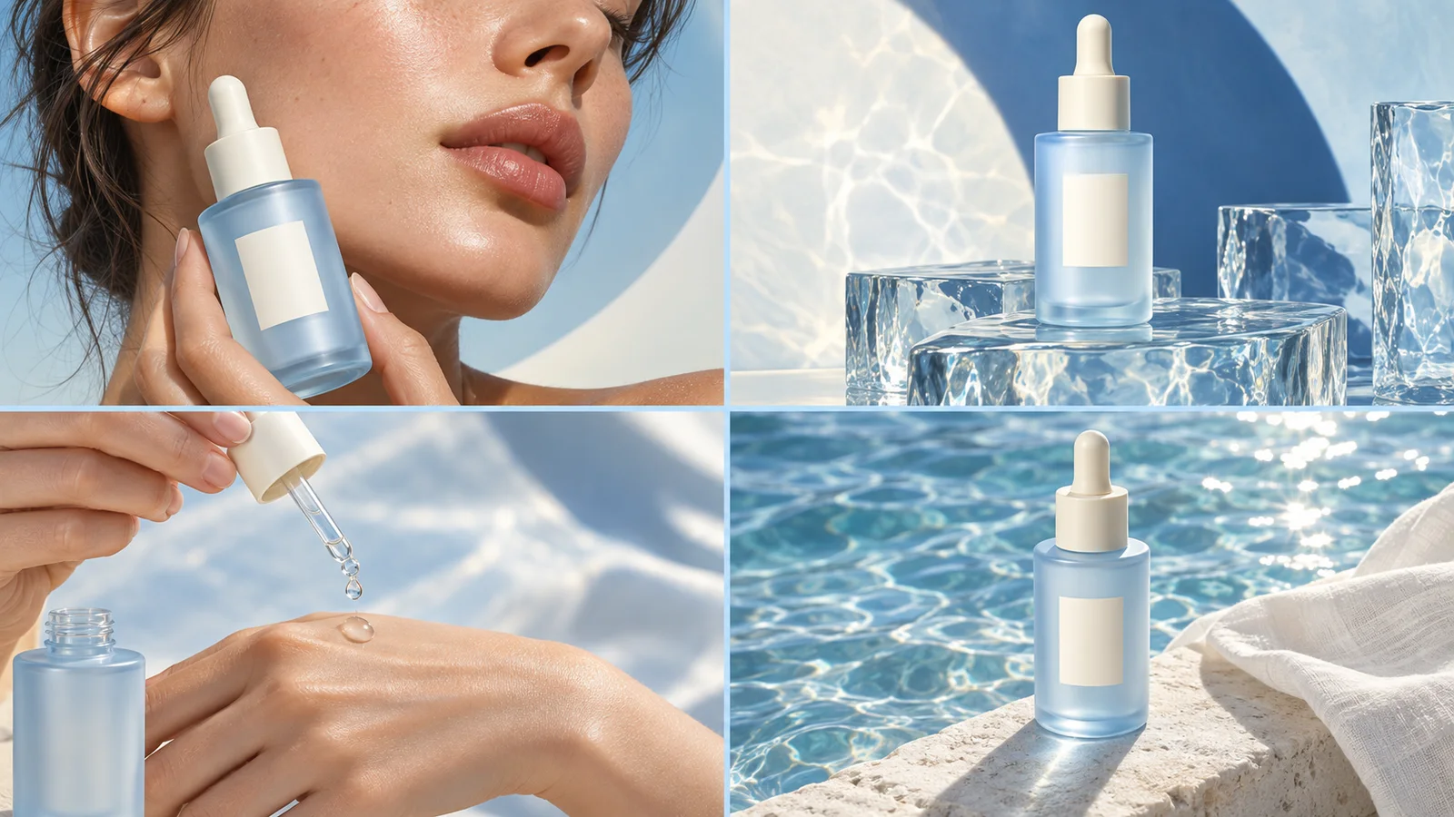
When a clear bottle disappears into its background, start with the edges and the scene visible through the glass. A pale outline on white has little contrast; a dark outline on black has the same problem. Choose a light background with darker contours, or a dark background with lighter contours, then inspect the interior separately. Making the whole bottle brighter often turns transparent glass into a milky solid.
This is a material-rendering problem. It is different from removing a white background from a PNG: a file can have a correct alpha channel while the glass inside it still looks wrong. If you see a white rectangle around the entire image, use the transparent PNG guide first.
Separate three parts of the bottle
Look at the same product in three areas: its outer contour, the body you can see through, and opaque parts such as a cap or paper label. They do not need the same treatment.
| What looks wrong | Inspect | Change first |
|---|---|---|
| One side disappears | Edge against the adjacent background | Introduce local contrast along that side |
| Bottle resembles white plastic | Interior haze and broad highlights | Restore transparency rather than increasing overall brightness |
| Old scenery remains inside the bottle | The scene seen through the body | Rebuild the transmitted background for the new setting |
| Cap is visible but label is dark | Lighting on opaque surfaces | Light the label without flattening every contour |
| Base looks thicker than the actual product | Bottom geometry and reference view | Match the reference before adding more shine |
Dark contours are not automatically dirty edges. They can be reflections that make the shape readable. Photography studio Kalory's glass guide describes using black cards to define contours and distinguishes bright-field from dark-field setups. The useful lesson for an editing brief is to choose which edges should contrast with the background; it is not to demand removal of every reflection.
Choose a background that still works through the glass
Imagine a fictional clear drinking bottle with a black screw cap and a small cream label. The reference is photographed against pale gray. You want an evening desk advertisement with a navy wall.
Changing only the pixels outside the silhouette can leave a pale gray patch inside the bottle. It now looks like a cutout pasted on the desk. The new scene needs to remain visible through the clear body, with distortion and highlights appropriate to its shape. The cap and label should remain opaque. A single transparency slider cannot describe all three regions.
Before editing, decide whether the product is empty or filled. Preserve the real fill level and liquid color when either is part of the product reference. Do not turn an empty bottle into a beverage just to add color. If the reference does not show an important side, obtain another view instead of inventing the construction.
For a first attempt, use a simple background with one broad change in tone. A complex bookcase behind the bottle creates many extra lines to inspect through the glass. Complexity can return once the material reads correctly.
A focused brief for a dark-background version
Attach the approved bottle image and the intended scene separately. In this hypothetical example, the bottle is empty:
Use @image1 for the exact clear bottle, black screw cap, cream label and empty interior. Use @image2 only for the navy desk setting. Keep the bottle proportions and existing label wording. Show the new setting through the clear body with believable distortion; do not retain the old pale background inside the glass. Give the outer contours restrained bright separation from the navy wall. Keep the cap and label opaque. Do not add liquid, a frosted finish, extra handles or a thick white outline. Keep the product as the main subject.You can use this brief in Panelly Studio. Reference the correct images by their actual names. This is a request for a new image version, not a promise of a physically exact render. Keep the source visible for comparison.
For a light-background version, replace the bright-contour instruction with darker contour definition against a pale setting. Avoid asking for both a glowing outline and heavy black borders everywhere. The object can become an illustration of glass instead of a photograph of it.
Inspect the result before adding the rest of the ad
At full size, trace the neck, shoulders and base. The outer shape should not become wider just because highlights were added. Compare label size and cap construction with the reference, then look through the body for leftover scenery or duplicated edges.
At the final viewing size, cover the label with your finger. Can you still recognize the bottle's silhouette? Then uncover it: does the label remain readable without competing with an exaggerated rim? These two checks reveal different problems.
In a four-panel campaign, keep the material consistent across the product close-up and usage scene. A clear bottle should not become frosted in the next panel. Different backgrounds may require different edge contrast, so ask for the same material rather than identical highlights.
Should clear glass always be on black?
No. Both light and dark backgrounds can work. Choose the one that supports the composition and leaves enough contrast at the product boundary. Colored and frosted glass need their own reference; do not treat them as clear glass with a tint filter.
Is a bright line around the bottle a good repair?
Only if it belongs to the lighting and shape. A uniform white stroke can separate the silhouette but usually says little about the material. Start with the weakest edge and request a specific local change.