Creative practice
Product Feature Callout Images: Point to the Detail That Matters
Choose which product details need labels, close-ups or a use scene. Includes endpoint checks and a complete four-panel brief with integrated feature callouts.
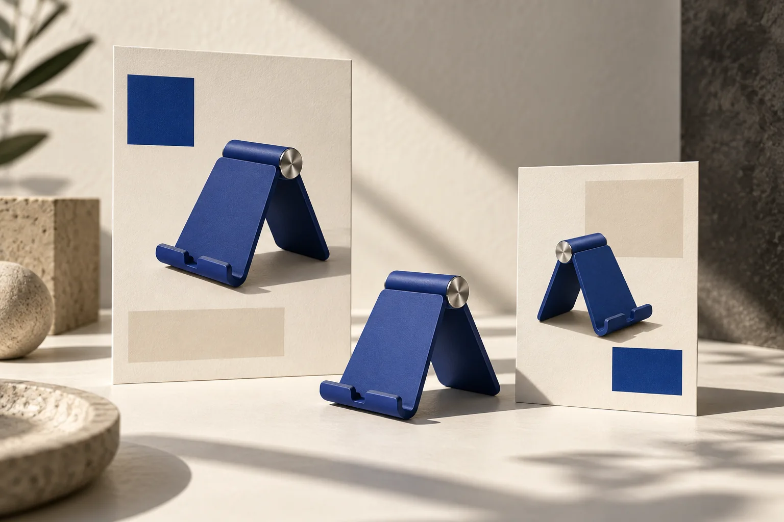
A useful product callout connects one short label to one visible feature. The line should end where the reader needs to look, and the label should explain something the image alone leaves unclear. Adding an arrow to every part of the product makes a diagram busier without necessarily making it more informative.
Start with the buyer's question. If they need to know where a zipper opens, a callout can help. If they need to understand whether a pouch fits their bag, a scale image may answer better. The right annotation depends on the question, not the number of features in a specification sheet.
Choose between a label, close-up and use scene
| Reader's question | Useful image treatment | Avoid |
|---|---|---|
| Where does this open? | One line to the actual opening | An arrow ending in empty space |
| What does the material look like? | A clear detail view | A label covering the texture |
| How large is it? | A known scale reference or verified dimensions | Inferring size from an unrelated prop |
| What comes with it? | A complete set view with clear identification | Arrows that make optional accessories look included |
| How does it fit into my day? | A realistic use scene | A specification diagram with no context |
A callout is a relationship between text and a particular part of an image. TechSmith's callout examples illustrate that relationship with labels, arrows and detail emphasis. That documentation explains an annotation technique; it does not establish an advertising conversion benefit or imply that Panelly exports editable Snagit elements.
Rewrite feature labels before drawing arrows
Take a fictional canvas pouch with one zipper opening and a short side loop. Suppose the brief lists “premium,” “convenient,” “versatile” and “modern.” None tells the designer where a line should end.
Replace those with details you can actually show. “Zipper opening” identifies a location. “Side loop” identifies a component. A more specific construction claim, such as “reinforced stitching,” needs a reference that supports it; do not infer reinforcement from a neat seam.
A label can also be unnecessary. If a large close-up already shows the zipper and the caption says how the pouch opens, another “zipper” arrow may simply repeat the information. Try removing it and check whether anything becomes harder to understand.
For this example, use two labels because there are two relevant features, not because two is a universal optimum. A product with one unclear detail may need only one.
Arrange the lines after the product view is chosen
Pick an angle that exposes the features. An annotation cannot rescue a hidden opening. Place labels in nearby empty areas so the lines are short, then inspect their endpoints. Avoid routes that cross each other or run through the product name.
Keep the same visual treatment for labels doing the same job. If one feature has a giant bright badge and another has tiny gray text, the difference suggests a hierarchy. Use that only if you mean it.
Do not make the product smaller simply to fit the entire specification sheet. Move a secondary detail into another frame, or use the product page for the longer explanation. In a four-panel ad, the feature frame can carry the callouts while the usage and closing frames remain quieter.
Use @image1 as the exact canvas pouch and @image2 only to confirm the zipper opening and side loop. Create a four-panel product advertisement: a clean pouch introduction, a closer feature view, the pouch on an everyday desk, then a composed product ending. In the feature frame only, add two short labels: “Zipper opening” and “Side loop”. Connect each label to its actual component with a thin, clearly ending line. Keep lines uncrossed and away from the product name. Preserve the pouch size, fabric, seams and color. Do not add pockets, straps, dimensions or material claims. Include the closing text “Meet your everyday pouch” in the finished image.This fictional brief can go directly into Panelly Studio. The labels and closing line can be generated within the complete image. Separate text layers are only relevant if your later handoff specifically requires independent editing.
Check the endpoint, wording and small-screen view
Review each annotation as a pair. Read the label, follow its line, and ask whether the endpoint identifies exactly that feature. A perfectly spelled label still fails if its arrow points to the wrong seam. A correct endpoint still fails if the label promises a feature the product does not have.
Then view the ad at its intended size. Can the line be followed without zooming? Does it disappear into the fabric? Does the caption still fit after translation? If the layout becomes crowded, shorten the label or give that feature a closer view; simply shrinking all the text makes the diagram harder to use.
Keep the approved image beside a revised version. A request to move one arrow may also alter the pouch, so compare the construction after every edit. Our reference-role guide explains how to keep product and layout references separate.
Should callouts appear in all four panels?
Only if each one answers a different useful question. In many concepts, one annotated feature frame gives the viewer enough explanation, leaving the others to establish the product, use and closing message.
What if the feature is too small to point to clearly?
Use a closer crop or a separate detail frame. Do not invent a magnified part that the reference does not show. A clearer view is often more useful than a longer label.