Tutorials
Claude Opus 5.5: Fix Brand Color Contrast Without Rebranding
Ask Claude Opus 5.5 to repair specific foreground/background pairs, then check the proposed colors with a deterministic contrast calculation.
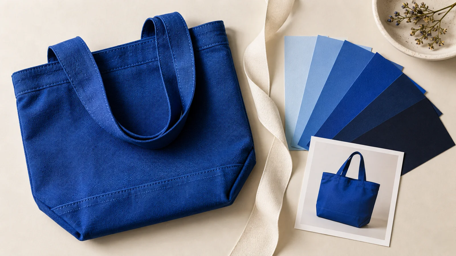
Ask Claude Opus 5.5 to repair specific foreground/background pairs, then check the proposed colors with a deterministic contrast calculation. A brand palette can stay recognizable while button labels, small captions and links get more readable. Changing every orange to brown is usually a poor brief; assigning different colors to different jobs is a better one.
This is a proposed review workflow with a worked color calculation, not a measured Opus performance test. The official prompting guide is useful for making the deliverable explicit. The constraint here is simple: preserve approved logo artwork and change only the UI tokens you identify.
Give the model pairs, not a mood board
Collect actual CSS values for text and the background immediately behind it. Include opacity, gradients, font size, weight and state. A screenshot helps locate the problem, but sampled screenshot pixels can be affected by antialiasing or compression. Use the underlying color values for the calculation.
The W3C contrast explanation specifies 4.5:1 for ordinary text and 3:1 for qualifying large text. The large-text definition is at least 18 pt regular or 14 pt bold, with equivalent-size considerations for other scripts. Do not round a failing ratio up to the threshold. Logo exceptions do not exempt the rest of a branded interface.
| Role | Preserve | Change candidate |
|---|---|---|
| Approved logo | Original artwork | Its placement or surrounding space |
| Small button label | Wording and readable size | Label color or button fill |
| Inline link | Meaning and destination | Text color plus an explicit underline |
| Decorative accent | Recognizable brand hue | No change unless it obscures content |
Review hover, focus and pressed states separately. Passing a text-pair calculation is not a complete accessibility audit; keyboard behavior and non-text indicators need their own checks.
A concrete orange-button example
Consider a hypothetical 16 px button using white text on `#FF4E00`. Compute relative luminance from linearized sRGB channels and use `(lighter + 0.05) / (darker + 0.05)`. This gives roughly 3.31:1, below the ordinary-text threshold. Black text on that same fill gives roughly 6.34:1. Check the unrounded result in your own calculator before approval.
That leaves two useful design directions: retain the orange fill and use a dark label, or keep a light label and develop a darker action token. Keep the vivid orange for decorative elements if the darker token feels too muted. Do not tell Claude to certify a color by eye. Ask it to produce candidates and leave a calculation column for verified results.
A designer discussion about inaccessible brand colors describes the same practical tension. It is evidence of a reader problem, not evidence that this workflow improves conversions.
Copy this repair prompt
Review the supplied CSS and screenshot for text contrast.
The approved logo is locked. Do not redraw it or replace the whole palette.
Button: background #FF4E00, label #FFFFFF, 16 px regular.
Create two options: keep the orange fill with a darker label, or keep the light label with a darker action fill.
For each option return the exact foreground/background values, affected token names, normal/hover/focus states and the smallest proposed CSS change.
Calculate contrast with the WCAG sRGB luminance formula if code execution is available. Otherwise mark ratios unverified and provide inputs for a calculator; do not invent passing values.
Preserve copy, destinations, spacing and component behavior. Add an underline for inline links so color is not their only identifier.
List remaining checks separately. Do not call the whole page accessible because one text pair passes.
Verify the patch in the delivered layout
Apply one option in a duplicate component, compare it at its actual display size, and recalculate every changed pair. Test on the real background rather than a white artboard. A semitransparent label needs its composited color; a label crossing a gradient needs checking against the relevant background range.
Read the button at narrow width and increased text size. Confirm the focus indicator is still visible and that a pressed state has not reintroduced the original low-contrast pair. Keep the approved token list beside the export so future ads and pages use the same action colors.
Where Panelly fits
After choosing verified text colors, use Panelly Studio to explore complete product-ad compositions with the product, background, headline and CTA together. Ask for a solid backing area when text crosses a busy image, then inspect the exported image at delivery size. Panelly is not presented here as an Opus integration or an accessibility certification tool.
For broader campaign consistency, see brand-style drift. For changing page structure, use the separate landing-page revision workflow.
Common questions
Can I just make the label bold?
Bold at a small size does not automatically qualify for the relaxed large-text threshold. Use the applicable size definition and measure the actual pair.
Should every brand color pass against white?
No. Evaluate the pairs used to convey information in the delivered design. A vivid decorative accent and a readable action token can have different roles.