Tutorials
Claude Opus 5.5: Turn App Screenshots into a Readable Promo Video
Plan a readable screenshot promo with Opus 5.5: a 12-second timing sheet, complete prompt and checks for distorted UI, small labels and missing exports.
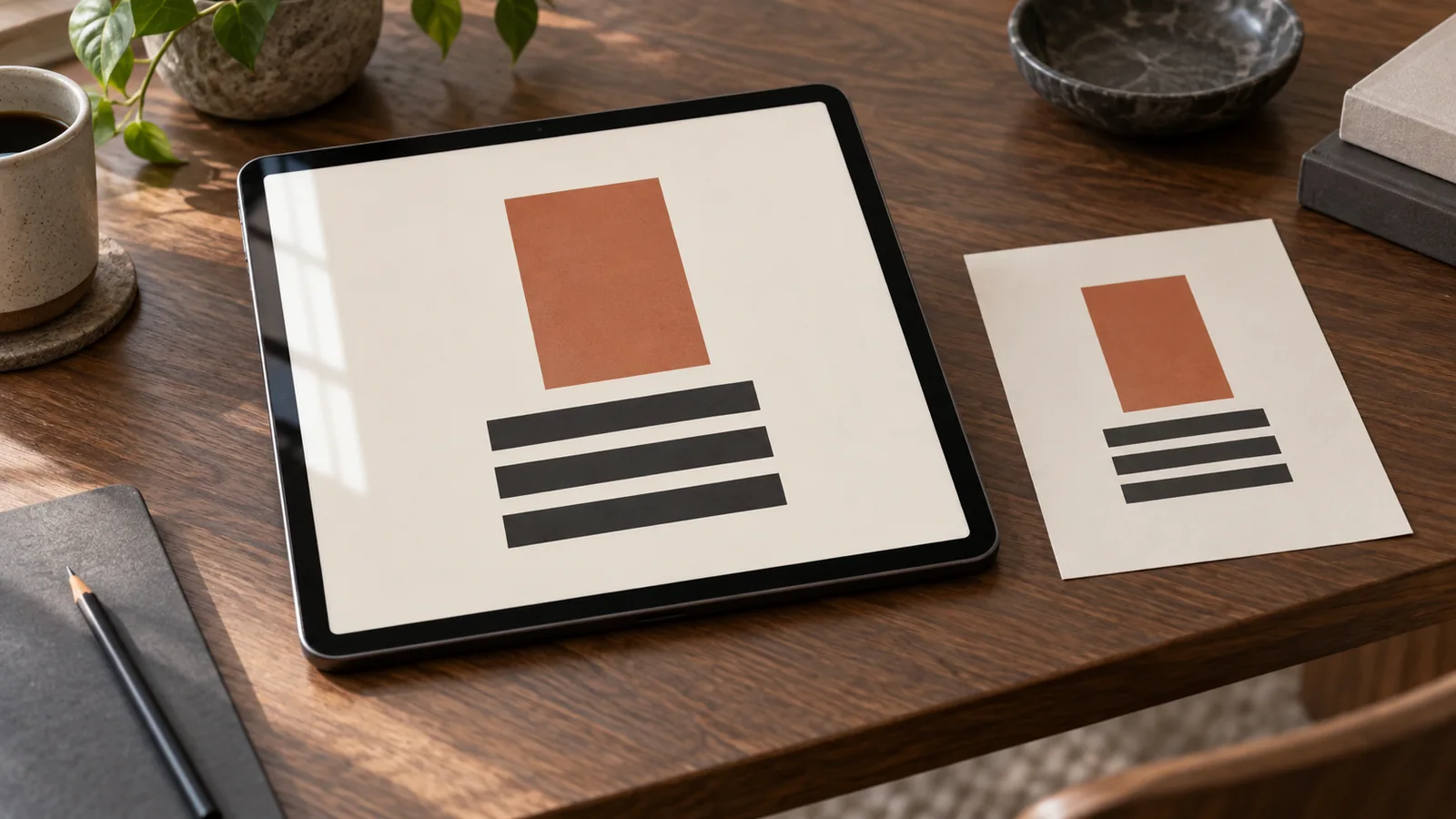
Use Opus 5.5 to plan and code a screenshot-based promo, then render that work with an available video tool. Start with three real screens, one product action and a short timing sheet. The most useful first version proves that the interface stays readable; a spinning phone should come later.
Claude's model specification lists text and image input with text output. A finished movie therefore needs a rendering path. Remotion documents video rendering, for example. This guide proposes a workflow; it does not report a Panelly model test or promise that a particular Claude workspace has those tools installed.
Lock the source screens before asking for motion
Use exported screenshots at a consistent device size. Name them `01-list.png`, `02-detail.png` and `03-result.png`. Keep a clean copy and list the one fact each image demonstrates. Replace personal data with a prepared demo account before capture, rather than asking the model to invent a new interface over the screenshot.
For our fictional task app, the list shows today's tasks, the detail shows a due-date selector, and the result shows a checked task. These screens support “Choose what to do next.” They do not establish automatic scheduling, time savings or a free subscription. A feature not visible in the reference needs a separate verified source.
Try a twelve-second structure first
The following is an original planning example, not a platform rule or a tested winning ad. At 30 frames per second, twelve seconds contains 360 frames. A frame range ends just before the next one starts, so there are no duplicated boundary frames.
| Time | Frames | Picture and purpose |
|---|---|---|
| 0–2 seconds | 0–59 | Show the actual list; establish the task immediately |
| 2–6 seconds | 60–179 | Enlarge the due-date area; hold the useful detail |
| 6–9 seconds | 180–269 | Show the checked result without inventing a tap sequence |
| 9–12 seconds | 270–359 | Hold the app name and “See how it works” |
A screenshot is a still state, not proof of an interaction. If you lack a recording of a tap, use a clean cut or label the sequence as a demonstration. Do not animate a nonexistent button just to connect two screens. Keep the camera still during the moment viewers need to read.
Give Opus this complete production brief
Plan a 12-second, 1080 × 1920, 30 fps promo for the supplied fictional task app. Inputs: 01-list.png, 02-detail.png, 03-result.png and the approved logo. The only message is “Choose what to do next.” CTA: “See how it works”.
First list which supplied screen supports each statement. Keep the UI pixels and wording unchanged. Do not add features, reviews, prices or a fake tap animation. Use frames 0–59 for the list, 60–179 for the detail, 180–269 for the result and 270–359 for the end card.
Make a plain first pass with cuts and one detail enlargement. Hold text still while it is read. Keep each screenshot's aspect ratio. If a renderer is available, create editable source and render a preview; otherwise return the timing sheet and identify the missing tool. Do not claim a render succeeded without a file.
Deliver the source, input asset list, preview and checks actually performed. After approval, add at most one restrained camera move; preserve the readable holds and all product facts.
Review the encoded file, not only the timeline
Open the exported video at phone size. Pause at the beginning, each screen change and the final frame. Check for stretched screens, missing fonts, accidental blank frames and an end card that disappears too soon. Play once without sound: the viewer should still understand the action and destination.
If a 1080-pixel-wide video is displayed at 360 pixels, a 60-pixel label becomes roughly 20 display pixels. That arithmetic does not guarantee legibility: contrast, typeface and motion still matter. Enlarge the relevant screen region before increasing every caption or covering the app with text.
| Symptom | First correction |
|---|---|
| Attractive movement, unreadable feature | Remove movement during the detail hold |
| UI looks stretched | Preserve screenshot aspect ratio and crop the container instead |
| Export differs from preview | Check font loading and asset paths in the renderer |
| Too many features compete | Keep one action and save the rest for another clip |
Carry the approved idea into an ad
Keep the timing sheet with the source screens, so the next edit changes a named interval rather than rebuilding the whole sequence. In Panelly Studio, use the approved product reference and message to create a companion four-panel image. Titles and CTA can stay inside that complete image. This is a creative handoff, not a claim that Panelly includes a Remotion renderer or an Opus selector.
For an existing web page, the separate Opus landing-page revision guide covers preserving its purchase flow. Here the acceptance target is a readable exported movie.
FAQ
Do I need a 3D phone model?
No. Start with flat screenshots. A device frame is useful only if it improves context without making the interface too small.
Can a good-looking clip prove the product works?
No. Use real recordings when the claim depends on an actual interaction, and keep proposed visual demonstrations distinct from measured product results.