Tutorials
Cosmetic Swatch Ads: Show Color, Coverage and Finish Separately
Separate shade, coverage and finish in cosmetic swatch ads. Use real application references and a complete cream-blush brief without universal shade-match claims.
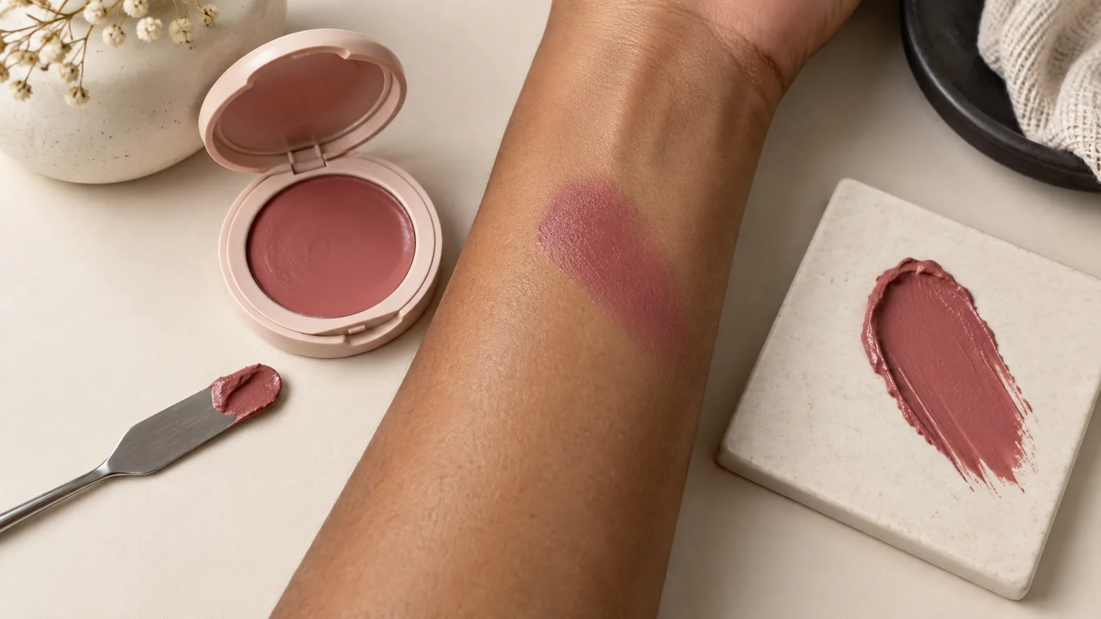
A makeup swatch can answer three different questions: what color it is, how much skin it covers and how its surface catches light. One thick smear on a white tile cannot answer all three. Choose the question first, keep an actual swatch reference, and avoid turning a creative advertisement into an unsupported shade-match promise.
A generous cream swipe may work beautifully as a texture image. A buyer comparing two blush shades also needs to understand the application and the surface underneath. Those are different visual jobs.
Match the image to the claim
| What the image should explain | Useful reference | What it does not establish |
|---|---|---|
| Product texture | A real swipe with visible ridges | How it looks blended on skin |
| Relative shade difference | Swatches under the same capture conditions | A match for every viewer's complexion |
| Coverage after application | Documented product amount and blending | Longer wear or a treatment effect |
| Shimmer or sheen | A view where the surface reflection is visible | Identical appearance at every angle |
Visual Education's cosmetics workshop demonstrates photographing swirls and sweeps with controlled reflections. That kind of creative texture work is useful, but should not be confused with a measured foundation match.
Keep the application comparable
Consider a hypothetical cream blush in two approved shades, Rose and Clay. You want customers to compare their appearance after a light application. Use the same application tool, a comparable amount, the same blending method and the same capture setup. Record what you did so another image can be made under similar conditions.
If Rose is a thick opaque swipe and Clay is a barely visible blend, the photograph mixes shade with coverage. Reshoot the comparison rather than increasing Clay's saturation until it looks stronger. Keep a little untreated skin visible and do not lighten the skin to make the product color stand out.
This is a suggested capture procedure, not a tested claim about a specific formula. Different substrates and application thicknesses can change what the photograph communicates. The color-consistency guide covers capture and export checks; this article adds the application and finish decisions specific to swatches.
Give each reference a clear job
Use the real compact or tube for packaging identity. Use an approved physical swatch photograph for the applied appearance. If you also have a thick texture swipe, identify it as texture rather than instructing the system to make the skin result equally opaque.
@image1 is the approved cream blush compact. @image2 is the real, lightly blended Rose swatch on skin. Create a quiet beauty advertisement that preserves the compact and the swatch's visible skin texture, coverage and shade relationship. Keep the existing skin tone. Use a pale neutral background with soft light; do not add glitter, increase coverage or smooth away the application edge. Include “A touch of Rose” and “See the shades” in the finished image. Do not imply that this shade matches every skin tone.In Panelly Studio, use this as a specific creative brief, then compare the returned image with the actual reference. Generating a convincing swatch is not a measurement of the product's color or performance. Keep the real swatch available where shoppers make their shade decision.
Inspect three things separately
First compare the color relationship: did a muted rose turn coral? Next compare coverage: did visible skin disappear? Finally compare finish: did soft sheen become large glitter particles? A request that only says “keep it accurate” makes these separate changes harder to diagnose.
For a targeted revision, say which property moved: “The shade remains right, but the swatch became opaque. Restore the original visible skin texture and light coverage; keep the compact and composition.” Review the exported image at its real display size, because a small thumbnail can hide both grain and subtle boundaries.
Can I use a tile swipe instead of a skin swatch?
Yes for explaining texture or showing a creative motif. Label the context clearly and do not present it as proof of the applied result on skin.
Should every swatch have a dramatic highlight?
No. A highlight can reveal finish, but a broad bright reflection may hide the underlying color. Choose the lighting for the question the picture needs to answer.