Tutorials
Why Product Photo Colors Look Different: A Practical sRGB Workflow
Find whether a product-color mismatch comes from the creative, export or display. Includes a diagnostic table and a clear workflow for web-ready images.
Product photo colors can look different because the image itself changed, its color profile was handled differently, or the viewing display is different. Compare the same file before adjusting the product color. For ordinary web delivery, an sRGB copy is a practical starting point, but it cannot make every screen identical or repair a product that was generated in the wrong color.
The fastest useful diagnosis is a three-way comparison: the accepted original, the exported delivery file and the image customers actually see. This tells you where the mismatch first appears.
Identify which kind of mismatch you have
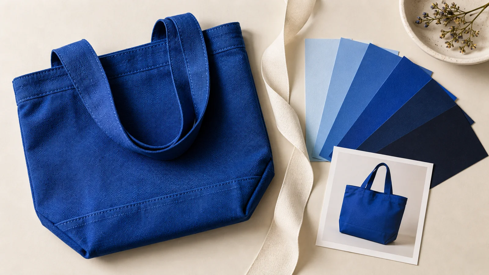
Imagine a fictional navy canvas bag that appears purple on a product page. Do not immediately recolor the master image. First establish whether the purple cast is already present in the original or appears later.
| Observation | What to investigate | First useful comparison |
|---|---|---|
| Bag looks purple in every view of the original | Capture lighting, editing or generated product color | Original against a reliable product reference |
| Original looks right, exported copy changes | Export color space, profile handling or adjustments | Both files in the same color-managed application |
| Local delivery file looks right, uploaded image changes | Destination transformation or the file actually served | Delivery file against the published version |
| Same file differs between two applications | Application color handling and display settings | Exact same file under comparable viewing conditions |
| Same file differs on two devices | Screen settings, calibration and viewing environment | A consistent reference display and a second normal viewing check |
These are diagnostic directions, not a remote diagnosis of a particular screen. More than one factor can be involved.
Separate the master from the web copy
Keep an accepted master that preserves the work you may need later. Export a separate delivery copy for the intended destination. Record its dimensions, format and output color profile so you can reproduce it without guessing.
Adobe recommends sRGB for images intended for web viewing and describes converting images from other embedded profiles before saving for the web. It also explains that uncontrolled displays limit how consistent online color can be.
If you are using Photoshop, its Convert to Profile workflow is the relevant operation for converting between known profiles. Do not merely relabel a file and assume its appearance has been preserved. If the file's source profile is missing or uncertain, establish that information before making arbitrary profile changes.
A file extension does not tell you the complete color workflow. Two JPEGs can carry different profile information or have been processed differently. Inspect the file you are actually handing off.
Do not confuse a working color space with an output choice
A photo application can edit in one color environment and produce a delivery file in another. Capture One's color documentation distinguishes its internal processing from output conversion through ICC profiles. The relevant handoff is the exported image, not only how the RAW preview looks inside the editor.
For a product team, this means recording the output choice in the delivery note. “Looks correct in my editing application” is useful context, but the website will serve an exported file. Check that file before uploading it.
For generated artwork, start with the downloaded image and inspect its existing properties. Do not assume that it uses the same camera-RAW workflow or that the creation tool exposes professional color-management controls.
Correct the image when the product itself is wrong
Color management cannot turn an incorrectly illustrated burgundy bag into an accurate navy bag. If the creative already differs from the product reference, make a creative correction first.
A useful revision request in Panelly Studio could read:
The bag in this version looks purple. Match the navy canvas in @image1.
Keep the cream stitching, rectangular front pocket and silver zipper from the reference.
Keep the warm background, but reduce the colored light falling directly on the bag so its navy color remains recognizable.
Generate the complete revised four-panel image with the same product name and final line.
This asks for a visual outcome, not a promise of an exact color value across every rendered surface. Compare the revision with the reference under the same viewing conditions. If the warm scene is still shifting the product too strongly, use a more neutral product-focused frame alongside the atmospheric scene.
A hex color alone does not fully describe a photographed material. Texture, highlights and shadow all affect the visible surface. Use the actual reference and specify which appearance should remain recognizable.
Check the uploaded asset under ordinary conditions
After export, open the delivery copy in a color-managed application and in the destination preview. Make sure you are comparing the same version, not a cached old image or a screenshot that has passed through another workflow.
Then inspect the customer-facing page. If it serves a transformed image, compare that result as well. A useful delivery note for the fictional bag might say: “Navy-bag v3; accepted against reference A; exported web copy in sRGB; product page checked on desktop and phone.” It records what you checked without claiming universal color accuracy.
Use a second device as a practical check, not as an automatic authority. A warmer phone screen does not necessarily mean the master needs to be cooled. Check display modes and viewing conditions before changing every product image to compensate for one device.
Keep a neutral reference in the campaign
An atmospheric ad can use strong light and color while a product-detail image provides a clearer view of the actual finish. Give those images different jobs. The campaign can remain visually distinctive without making a blue item look like a different purchasable variant.
For creative choices before export, see the product-lighting guide. For the delivery stage, preserve a repeatable export and comparison process. Solving the right stage prevents a technical adjustment from becoming an unnecessary redesign.
FAQ
Will sRGB make my images identical on every phone?
No. It is a practical web-delivery choice, but display settings and viewing conditions still vary. Use it as part of a consistent workflow rather than an absolute guarantee.
Should I change the product color if one browser looks wrong?
First compare the exact same file in another suitable application and check its profile and export history. Changing the creative before diagnosing the handoff can introduce a new error.
Does Panelly provide ICC-profile editing?
This workflow does not assume that capability. Refine the complete creative in Studio, then use an appropriate image application for any required profile inspection or conversion.