Creative practice
GPT-6 Astra for Packaging Design: Develop a Concept You Can Use in an Ad
Use GPT-6 Astra to organize packaging concepts, compare information hierarchy and refine one direction before bringing the selected package into a product ad.
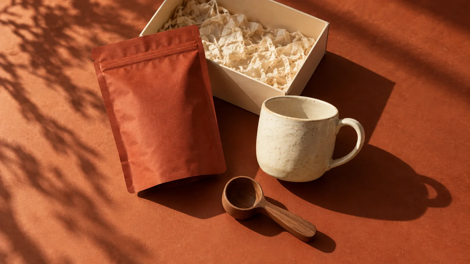
Use GPT-6 Astra for packaging design to turn a product brief into specific visual directions, organize the front-of-pack information and write useful revision requests. Pair that reasoning with an image workflow to explore the package's appearance. Decide whether you are inventing a new package or advertising an existing one before generating: those tasks have very different rules about what may change.
The Astra model documentation lists image input, text output and support for an image-generation tool. Packaging concepts depend on the image tools available in your chosen environment. A concept image is useful for design decisions; a printer still needs the production files and specifications agreed for the actual package.
Separate a new concept from an existing product
When a product already exists, its label, silhouette and variant name identify the thing the customer will receive. Advertising should preserve them. When you are exploring a new package, you can change those decisions deliberately and document the candidate you choose.
| Task | What can change | Useful deliverable |
|---|---|---|
| Explore a new package | Composition, palette and visual motif | Comparable concept views |
| Refine a selected package | Named weak points in the chosen direction | Revised concept plus change notes |
| Advertise an existing package | Setting, light and composition around it | Ad that retains the actual package |
| Prepare production | Details agreed with the supplier | Supplier-compatible artwork and specifications |
Mixing these tasks creates expensive confusion. A generated redesign may look excellent while making a real product advertisement inaccurate. Label your references as “existing product” or “concept direction” before asking for a change.
Write the information hierarchy first
For this original exercise, imagine a fictional coffee pouch called Ember. The supplied front copy is “Ember,” “Whole bean coffee” and “250 g.” The physical format is a standing pouch. No origin, tasting note, certification or environmental claim has been supplied.
Ask Astra to decide what a shopper should read first, second and third. A reasonable candidate is brand, product type, then quantity. Another could lead with a distinctive visual motif while keeping the product type prominent. Compare what each choice communicates; do not use extra badges to fill an empty area.
The hierarchy can remain inside the generated package image. There is no need to split every headline, label and CTA into separately managed assets just to explore a concept.
Compare different ideas using the same view
Explore a restrained typographic direction and a more expressive illustrated direction. Keep pouch proportions, copy, camera angle and background consistent. That makes the visual concept easier to judge without the appeal of a different scene dominating the comparison.
Develop two packaging concepts for fictional Ember whole bean coffee.
The package is a standing pouch. Exact front copy: Ember; Whole bean coffee; 250 g.
Direction A: warm charcoal type on uncoated-looking cream, with a clear typographic hierarchy.
Direction B: a large abstract ember-shaped illustration in rust and cream, with equally clear product naming.
For both, keep the same pouch proportions, three-quarter camera and neutral light.
Describe the concept and the exact image request for each direction.
Use only the supplied copy. Do not add provenance, certification or material claims.
If image tools are available, create the comparable views and retain their full text in the image.
These are authored exercise prompts, not reported model outputs. After running them in your environment, inspect the actual lettering and package outline. If one concept looks more premium only because it has dramatic shadows, rerender it under the shared neutral light before choosing.
Review the package at the size customers will see
A full-screen mockup makes almost any label easier to read. Reduce it to the approximate size of a product card or an ad panel. Can you still identify coffee, distinguish the brand and find the quantity if that information matters in the placement?
Compare the front view with the three-quarter view. A word placed across a deep side fold may be clear in one and distorted in the other. Keep essential information where the intended view can show it. A photographic reflection should not become the only thing giving the lettering contrast.
If the package will become physical, discuss the selected direction with the supplier before treating the image as production artwork. Material appearance in a rendering does not establish the material that can be sourced, and a visible rectangle is not a verified cutting or folding specification.
Revise the decision that failed
For the Ember example, a precise instruction might be: “Keep the illustrated ember motif and the pouch shape. Increase the visual separation between ‘Ember’ and ‘Whole bean coffee.’ Move the quantity away from the fold while keeping the same exact wording and neutral camera.”
That revision has an observable purpose: make product identification clearer. “Make it luxurious” could change the palette, finish, typography and even the format at once, leaving you unsure which change helped.
Keep rejected concepts in your working files, but use one selected package as the reference for the campaign. Otherwise, the ad can combine a label from one candidate with a silhouette from another.
Turn the selected package into a four-panel campaign
Bring the approved concept or real product reference into Panelly Studio. For Ember, ask for a morning coffee moment, a clear pouch close-up, a brewing context and a closing product view. Specify the exact headline and invitation you want rendered within the complete image.
If the package is still fictional, present the resulting campaign as a concept internally. If you are advertising a real product, use the final package reference and its actual supplied facts. The modeling and packaging exploration should simplify the advertising brief, not introduce competing versions of the product.
FAQ
Can I use this for an existing brand?
Yes. Supply its existing package and brand assets, then define whether you want a concept redesign or an advertisement that preserves the current product.
Does a good mockup mean the design is ready to print?
No. Confirm the supplier's required production format, dimensions and material specifications separately. A mockup answers visual questions; it does not establish that production handoff.
Should I remove all text and add it later?
That is not required for this concept workflow. Request the final wording directly in the image and inspect the result. Choose a later production-artwork process only when the actual manufacturing task requires it.
How many directions should I request?
Begin with a small number that differ in a meaningful design decision. Two understandable alternatives are more useful than ten nearly identical pouches with different background colors.