Creative practice
Ad Creative Feedback Examples: Turn Vague Notes into Useful Edits
Replace “make it pop” with clear product-ad feedback. Use six before-and-after examples, a complete revision prompt and a practical version comparison.
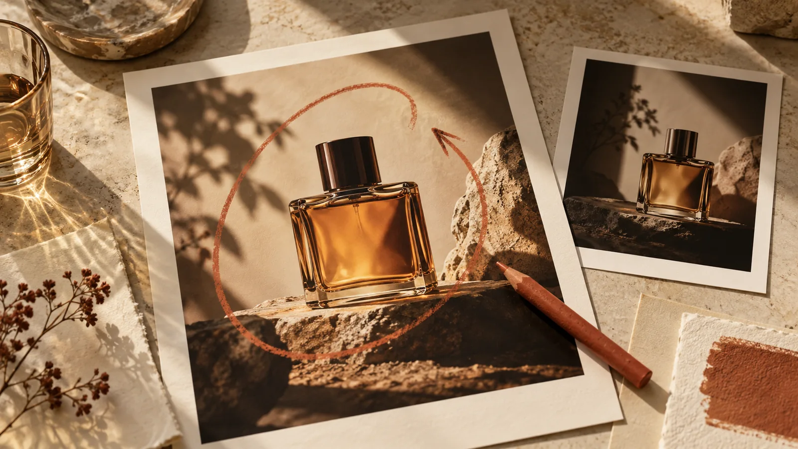
Useful ad-creative feedback identifies the visible problem, explains what should become clearer and names the details that should stay. You can say this in ordinary language. “The bottle disappears into the background; give it more separation while keeping the amber glass and label” is enough to start a focused revision. It does not require a technical design specification.
When you are editing a complete AI-generated ad, also refer to the exact version. A clear note attached to the wrong image creates another round of confusion before any creative work begins.
Turn a reaction into an observable change
Asana's guidance on constructive criticism emphasizes feedback that is specific and actionable. For an advertisement, connect that principle to what the viewer should notice or understand.
Here are six original examples for product creatives:
| First reaction | More useful revision request | What to keep |
|---|---|---|
| Make it pop | The dark bottle blends into the background. Add a lighter area behind its silhouette. | Bottle shape, label and amber color |
| It is too busy | The props compete with the product. Remove the two foreground objects and give the bottle more clear space. | Main product position and headline |
| Make it premium | Use a quieter background, softer reflections and more space around the product name. | Exact product and existing offer |
| The story is confusing | The first and third scenes both introduce the product. Make the third show the actual use situation. | The central benefit and final action |
| The text is wrong | Replace the final line with “Explore the collection.” Remove the extra discount badge. | Brand name and product facts |
| It looks like another product | Match the short rounded cap and rectangular label in my reference. | The accepted setting and overall mood |
The final column is especially helpful for AI revisions. It tells the system which parts of the current direction you value. It does not guarantee those pixels remain identical, so compare the new version afterward.
Explain the problem before prescribing every detail
You can give an exact instruction when the correction is factual: the name is misspelled, the cap is the wrong shape, or the set includes one cup rather than two. For a design problem, explaining the outcome leaves room for a better solution.
“The product name is hard to read on the phone preview” is more informative than “increase the type by 12 percent.” The designer might improve contrast, shorten the line or simplify the background instead of only enlarging the text.
Likewise, “the first frame does not show why someone would need this product” points to a creative issue. Moving a decorative element will not solve it. Separate that concept problem from smaller changes to spacing or color.
Keep one revision round focused
Suppose a fictional desk-lamp ad has three issues: the lamp has the wrong switch, the first frame is visually crowded and the final caption is too small. Start with the incorrect product feature and the main communication problem. A polished incorrect lamp is still the wrong advertisement.
Use a short priority order in your message:
- Match the lamp's actual switch and base from the reference.
- Simplify the first frame so the working desk is immediately understandable.
- Make the final product name readable at the intended display size.
You do not need to hold back every smaller preference. But distinguish a required factual correction from an optional art-direction experiment. Otherwise, a minor color preference can obscure the edit that determines whether the creative represents the product correctly.
Send a natural-language revision that stands on its own
Here is a complete original message you could use in Panelly Studio:
Use the latest four-panel desk-lamp version as the starting point.
The mood is right, especially the warm pool of light on the notebook.
The lamp itself needs to match @image1: a flat circular base and a small switch on the stem, not a touch button on the base.
The first frame also feels crowded. Remove the extra plant and the loose cables so the desk and lamp become the focus.
Keep the cream finish, the working-at-home scene and the final line “Light for the work ahead.”
Generate the revised complete ad without adding new features or changing the offer.
This message combines a factual fix, a layout change and a preservation note. It keeps the conversation flexible while giving the next version a clear purpose. The image reference supplies visual evidence; the words explain which detail matters.
Integrated headline and CTA text can remain part of the generated image. You do not have to create a separate text-layer workflow to ask for precise wording. Verify the actual result instead of assuming that a successful generation followed every instruction.
Compare versions against the request
Put the accepted starting version beside the revision. First check the requested change: did the base and switch become correct? Then check the preserved details: is the cream finish still right, is the useful pool of light still visible, and does the final line remain accurate?
A simple comparison note can read: “Product shape corrected; first scene clearer; new version introduced a second lamp in frame three.” That separates progress from a new issue. Your next message can address the new issue without restarting the whole brief.
Avoid deciding only that the second image feels “better.” Save why it is better. That record makes later creative choices easier and helps a collaborator understand which parts of the direction are intentional.
Know when the request is actually a new concept
Changing the product audience from office workers to outdoor campers is not just a lighting adjustment. Replacing a quiet product demonstration with a humorous character story is a new concept. Treat it as another creative direction so the previous version remains available.
A useful sentence is: “Keep this version, and explore an alternative for…” You can then compare concepts separately from corrections. For planning that comparison, use the small-batch ad testing guide rather than assuming every new image belongs in one undifferentiated pile of variants.
FAQ
Do I need design vocabulary to give good feedback?
No. Identify what you see, what is not working for the viewer and what should remain. Concrete references are usually more useful than specialized terminology.
Should I ask for one change at a time?
Group changes that solve the same problem, and prioritize them. Several related edits can fit one message. A long list of unrelated preferences is harder to evaluate afterward.
Will a precise AI edit keep everything else identical?
Not necessarily. A complete new generation can change unrequested details. State what should remain and compare the final version with the reference before choosing it.