Tutorials
Why Your Product Looks Pasted In: Fix Shadows, Scale, and Lighting
Fix the pasted-on look after replacing a product background: compare shadows, scale and lighting, then revise with focused image-reference prompts.
If a product looks pasted onto its new background, check where it touches the surface, how large it looks beside nearby objects, and which direction lights it. A cleaner cutout alone will not fix a jar floating over a table or a cool studio highlight inside a warm window-lit room. Name the mismatch, then request one correction at a time.
This guide starts after background removal. For white rectangles and transparent exports, use the transparent product images guide. Here, the task is making the product belong in the finished advertising scene.
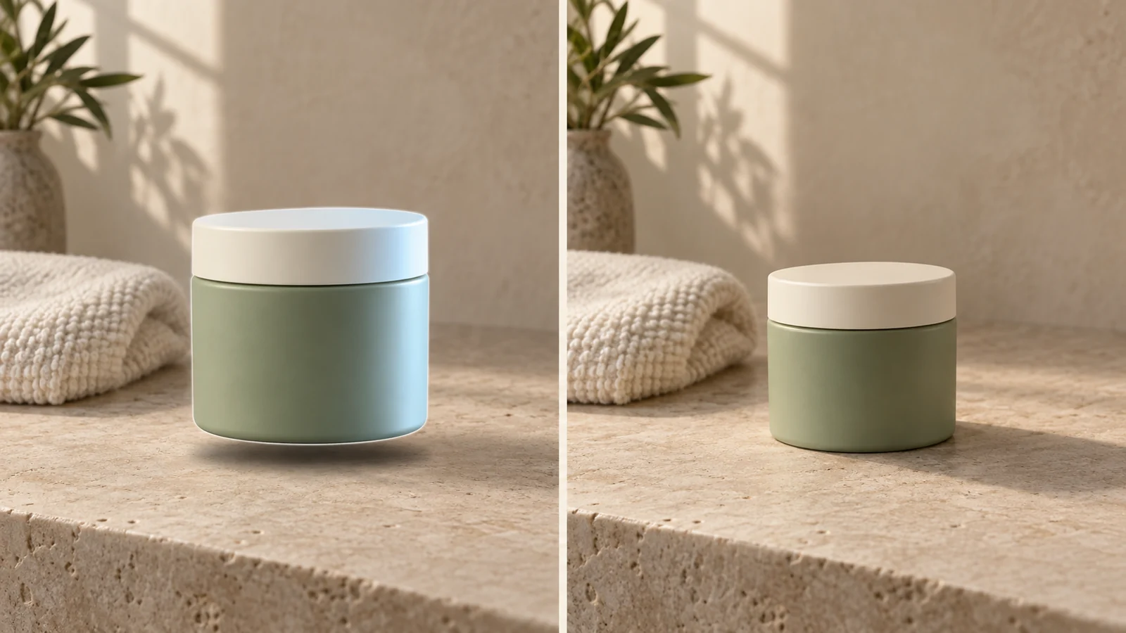
Read the comparison: what makes the jar feel present?
We created this paired illustration with AI for this article. The jar is fictional; the two sides are intentionally designed examples, not before-and-after evidence from a Panelly editing session. They demonstrate an art-direction target, not a measured guarantee of product preservation.
Look at the space beneath the left jar before studying its texture. A detached shadow leaves an apparent gap. The blue highlight on its right edge also competes with the warm light falling through the room. Its size dominates the towel. On the right, the base meets the stone, a darker contact area gives it weight, and the smaller silhouette sits more comfortably in the scene.
The illustration makes several changes together so the contrast is visible. When revising your own ad, separate those decisions: otherwise, you will not know whether the new shadow helped or whether the model simply replaced your product with a different one.
| What looks wrong | Check this part of the image | Describe this correction |
|---|---|---|
| Product appears suspended | Gap between base and surface | Rest the base on the table; attach a narrow contact shadow |
| Product looks miniature or enormous | Relationship to a known nearby object | Give actual dimensions and a useful size reference |
| Product seems lit in another room | Bright side, cast shadow and light color | Match the room's dominant window or lamp |
| Cutout has a pale outline | Edge against both bright and dark areas | Remove the old matte without erasing the silhouette |
| Material looks unexpectedly shiny | Highlight shape and surface finish | Preserve the original matte or glossy material |
First fix: attach the shadow to the contact point
For our jar, the first editing instruction is deliberately small. Keep the scene, position and product design; fix the base. Do not ask for a new bathroom, premium packaging and dramatic light in the same turn.
Use @image1 as the image to revise. Keep the green jar, ivory lid, towel and camera position. The jar currently looks suspended. Place its base directly on the stone and add a narrow contact shadow that starts at the base. Let the cast shadow extend toward the lower right and soften outward. Keep the stone matte. Generate a new version with this correction.The lower-right direction belongs to this example's upper-left light. Change it if your scene is lit differently. A generic dark oval under every object is not a universal solution, especially when a product rests on feet, a curved base or a transparent stand.
Shadow generation is a separate compositing problem: Hong and colleagues' research studies the shadow an inserted foreground object should produce on its background. That supports checking the receiving surface, rather than judging only the cutout. It does not establish how any particular Panelly generation will behave.
Second fix: use a size reference, then check the camera angle
For a worked brief, suppose the fictional jar is 7 cm wide and 6 cm high. Those are example dimensions, not measurements recovered from the illustration. A folded towel alone cannot prove physical scale because towels vary in size. A reference photograph showing the actual product beside a known object gives you a stronger starting point.
Try this follow-up after selecting the best previous version:
The real jar is 7 cm wide and 6 cm high. Keep its width-to-height ratio, lid shape and green finish. It looks too large beside the towel in this composition. Reduce its overall scale while keeping the base on the same tabletop. Keep the camera angle and background arrangement. Generate another version; do not stretch the jar or redesign the lid.Then inspect the lid. If the background is photographed from well above the table but the jar shows almost no top surface, size is not the only issue. Prefer a product reference taken from a compatible angle. Asking the model to invent an unseen top or back introduces a different product-accuracy question.
Adobe's Match Image documentation treats lighting, camera perspective and scale as related scene-matching decisions. Its controls belong to Adobe Dimension; Panelly uses conversational instructions, so there is no equivalent camera-calibration guarantee here.
Third fix: change the illumination without changing the product color
Our illustration's green jar should remain green when the blue edge light is removed. Warming the entire image until everything turns orange would hide one mismatch by introducing another.
Keep the jar's sage-green product color and matte finish. Remove the cold blue highlight on its right edge. Match the soft, warm window light coming from the upper left, with a quieter right side. Keep the ivory lid readable and the existing contact shadow. Do not add a glowing rim or recolor the packaging. Generate the revised image.Compare the lid, towel and jar together. They need not have identical brightness, but the lighting should explain their differences. If one side keeps looking studio-lit, simplify the brief instead of adding more adjectives such as cinematic, luxurious or hyperrealistic.
For a broader choice of lighting direction and material treatment, see product lighting for four-panel ads. This article's prompts address one existing scene, not a universal lighting preset.
Fourth fix: treat reflections and edges as material decisions
The example uses a matte jar and matte stone. A mirror-like duplicate beneath the jar would contradict that brief. For a glossy bottle on polished glass, however, a restrained reflected image might be appropriate. Describe the real surface before asking for more reflection.
Keep the current composition and lighting. The jar and limestone are matte. Remove the bright outline and the glossy reflected copy beneath the jar. Preserve the base contact shadow and the small natural highlights on the lid. Keep the silhouette intact. Generate a version with only this material cleanup requested.Glass needs extra care: a transparent bottle may contain the old room's transmitted colors as well as reflections on its exterior. If those cannot be reconciled convincingly, use a better reference or a simpler background. Do not turn a clear product opaque just to conceal the mismatch.
Use image references in Panelly without restarting the brief
Start in Panelly Studio. Add the product reference and describe the setting you want. When a result is on the canvas, type @ in chat and choose the image you want to revise. Use the identifier inserted by the interface; @image1 in the examples is a placeholder for your actual selection.
If you also attach the original product photo, tell Panelly which image defines the product and which is the scene to change. For example: “Use the uploaded jar photo for the lid and proportions; revise the selected canvas image's shadow.” Reference roles matter more than the number of adjectives in the prompt.
- Keep the current result as a comparison point.
- Select its image reference and name the single most visible mismatch.
- State what should remain: product shape, supplied label, composition or wording.
- Ask for the new version and inspect it against the previous one and the original product.
- Continue from the version that retains the correct product, not automatically the newest image.
These are instructions to a generative workflow. “Keep” and “only change” express intent; they are not pixel locks or a promise that untouched areas remain identical. The complete image can include its headline and CTA. This workflow does not require separating those into text layers.
For a four-panel ad, name the position that needs attention, such as “the product close-up at top right,” while asking to retain the other panels. Inspect all four afterward because the output is a complete image. The product consistency guide covers choosing the appearance details to compare.
Generation costs matter when iterating. As checked on September 17, 2026, Panelly lists 1K, 2K and 4K at 3, 5 and 8 credits per image; a four-panel composite counts as one image. Three 1K generations would use 9 credits if all three complete successfully. Check the cost shown in Studio before generating. The illustrative prompts above were not executed as a billed Panelly test.
A quick check before you export
Inspect the full ad at its intended viewing size, then zoom in on the product. Use these questions as your own visual check, not as an extra approval form:
- Does the base meet the surface where the shadow begins?
- Does the product's size agree with the reference and nearby objects?
- Can the visible light sources explain the highlights and cast shadows?
- Is the original material still recognizable, with no bright cutout fringe?
- Do the product, supplied label and ad wording still match the brief?
FAQ
Will a transparent PNG make the product look realistic automatically?
No. Transparency removes the surrounding pixels; it does not establish the new scene's contact, scale or light. Keep a good cutout, then evaluate the complete composition.
Can I fix everything by asking for “more realistic”?
It is a direction, but a weak diagnosis. “Attach the base shadow and remove the blue edge light” gives the next revision a clearer target. Start with the mismatch you can point to.
Do I need to edit the title and CTA separately?
No. Keep them inside the generated ad and explicitly ask to retain their wording and placement. Review them in each new result alongside the product. Separate text layers are not required for this workflow.
What if the correction changes my packaging?
Return to the best retained version, reference the original product, and narrow the requested change. If the product details still drift, a simpler scene or a new source photograph may be more useful than repeating the same prompt.
Bring one product photo and one scene idea to Panelly Studio. Start by making the product sit convincingly in the scene; refine the advertising direction from there.