Tutorials
Product Photography Props: Keep the Scene, Lose the Clutter
Choose props by their job, remove visual competition and refine a four-panel product scene with one focused editing request.
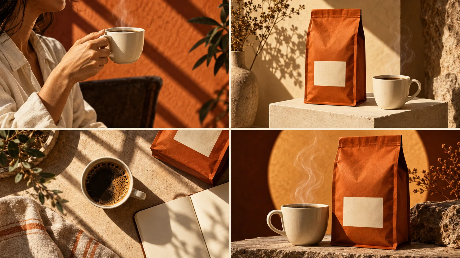
Choose props by what they explain about the product, then remove anything that competes with it. A cup can establish a coffee ritual; three unrelated books, a bright flower and scattered beans can turn the same ad into a photograph of a table. Start with one product, one context cue and a clear place for the message.
This guide is for advertising scenes. A store's required main listing image may need a different treatment; use the destination's rules for that image. For the broader placement decision, see white-background versus lifestyle photographs.
Give each prop a job
| Job | Useful example | Reason to remove it |
|---|---|---|
| Show the moment | A cup beside a coffee pouch | The cup becomes the apparent product |
| Explain handling | A towel beside a wash product | It hides the package or label |
| Establish a setting | One notebook beside a desk accessory | The scene reads as a stationery advertisement |
| Shape the composition | A low, quiet display block | The pedestal is more striking than the item |
Adobe's prop guide describes risers and backdrops as ways to present products. The table above adds an editorial decision: keep a prop only when you can state its job.
Start with a subtraction pass
Imagine a fictional rust-colored coffee pouch advertised for a quiet morning break. The first composition contains a cup, spoon, newspaper, vase and a pile of beans. You do not need a new visual style yet. First decide whether the pouch or the ritual is the main subject.
Keep the cup because it explains the moment. Remove the newspaper and vase. Move the spoon away from the label. Leave a small number of beans only if they are relevant to the actual contents; decorative ingredients can suggest a flavor that the product does not have. These are hypothetical creative choices, not results from a campaign test.
Use @image1 as the ad to revise. Keep the rust-colored coffee pouch, its label and the warm light. Keep one ivory cup behind it to suggest a morning break. Remove the vase, newspaper and loose spoon. Make the pouch the first thing I notice. Preserve the headline and CTA inside the finished image.Compare that version with the original at the size people will see in a feed. If the cup still attracts attention first, reduce its contrast or move it farther behind the pouch. Making every object larger usually makes the hierarchy worse.
Change visual weight before adding more objects
An object can dominate through brightness, a saturated color, a sharp edge or its position near the center. Size is only one factor. A tiny chrome spoon with a strong highlight can attract more attention than a larger matte package.
Try one adjustment at a time: soften the prop's highlight, use a quieter color, or move it toward the edge. Keep enough separation to read the product silhouette. If the setting stops making sense when a prop is removed, restore it in a less prominent position.
For a four-panel ad, concentrate context in the opening or use scene. Let the product close-up and closing frame be simpler. Four different arrangements do not require four different collections of decorations.
Turn the decision into a conversation
In Panelly Studio, add your product photo and explain the situation. You can ask for a recommendation before generation: “This is a workday coffee break. Which single prop would help explain it?” Then refine the selected image through an @ reference.
Use the identifier inserted by the interface; @image1 here is an example. Requests to preserve objects guide a new generation, rather than locking their pixels. Check the package and copy as well as the removed objects. The creative feedback examples show how to make the next correction specific.
FAQ
How many props should I use?
There is no universal number. One context cue is a useful starting constraint. Add another only when it explains something the first cannot.
Should every panel show the same props?
No. Repeat enough color or setting cues to connect the ad, while allowing the detail and closing panels to be quieter.
Can an ingredient be used only for decoration?
Think about what viewers will infer. Fruit next to a product can suggest its flavor or contents. Choose a relevant material or a neutral shape when that implication would be wrong.
Bring your current scene to Studio and ask what can be removed before asking what can be added.