Tutorials
Sandwich Cross-Section Photos: Show the Filling Without Inflating It
Make sandwich filling visible without adding an imaginary portion. Adjust the cut-face angle, separate reference roles and brief a four-panel cafe ad.
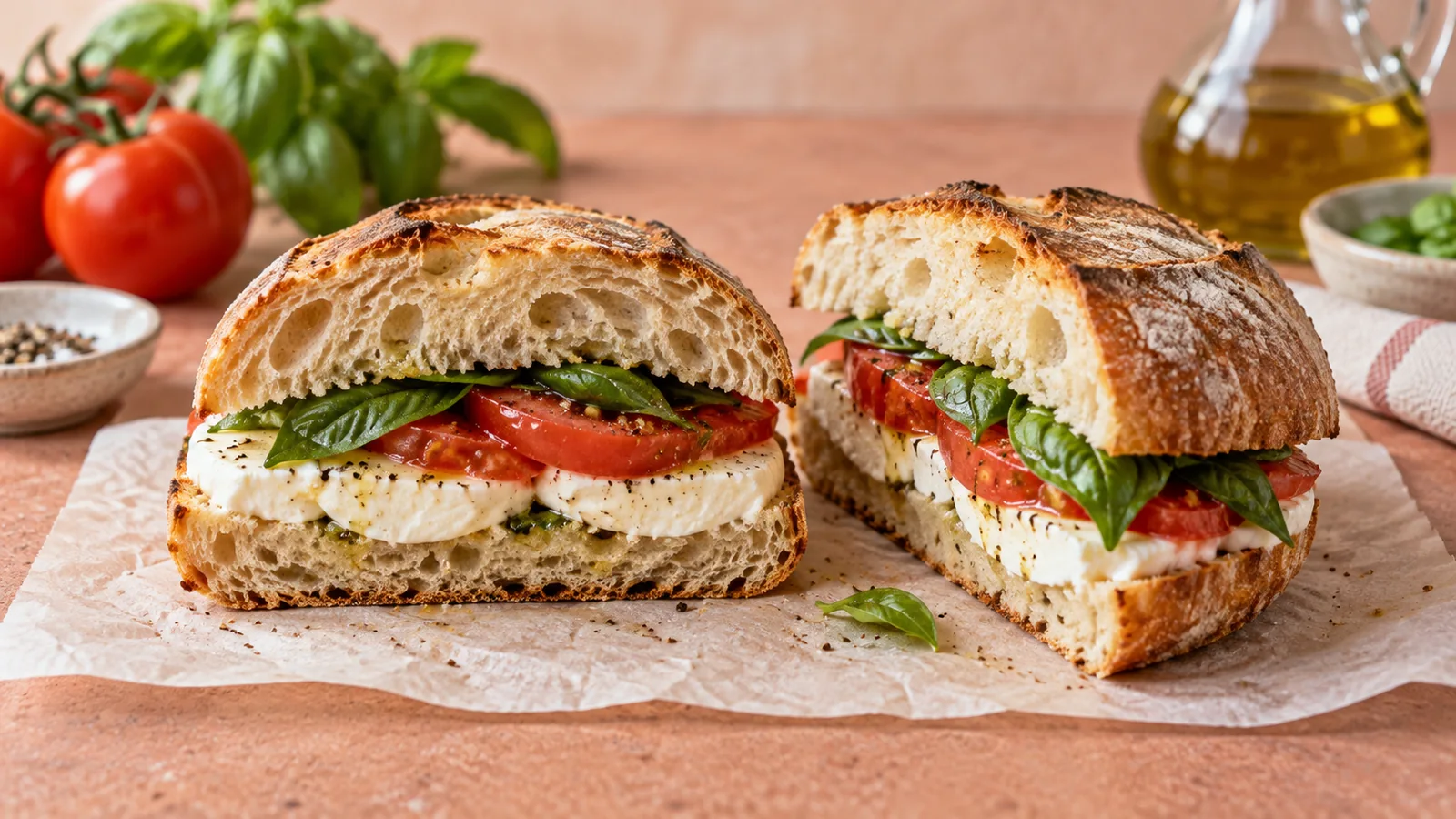
To make a sandwich filling readable, turn the cut face toward the camera and test a lower viewpoint before adding ingredients or increasing saturation. The photograph should explain the sandwich that is actually served. A taller stack is not automatically a better product image.
An overhead photograph can explain the whole meal, wrapper and side dish. A cross-section answers a different question: what is between the slices? Give each image one job rather than forcing the complete meal into a tight filling close-up.
Diagnose what hides the filling
| Problem | Check first | A useful adjustment |
|---|---|---|
| Mostly top bread is visible | Camera height and direction of the cut | Lower the viewpoint or rotate the cut face |
| Filling looks like a dark stripe | Light reaching the cut face | Add gentle fill without flattening the crust |
| The sandwich appears to contain extra food | Stacking and reconstruction | Return to the actual portion reference |
| One ingredient dominates | Its placement and visible area | Reposition within the real serving, not add more |
| The cut is crushed | Source preparation | Photograph a cleaner real cut rather than invent the interior |
Food photographer Lisa Bolton discusses how viewpoint changes which layers are visible in her sandwich styling article. Treat the angle as a choice to test, not a universal number that works for every loaf and filling.
Give two photographs different jobs
Imagine a fictional cafe selling a tomato, mozzarella and basil sandwich. Photograph the ordinary serving before planning an ad. Take one frame showing the whole sandwich and its packaging. Take another showing a real cross-section. The second reference explains the ingredients; the first preserves the portion and overall shape.
A useful review sheet has three columns: ingredient present, visible in the photo, and correction needed. If basil is present but hidden behind the bread, adjust the camera or existing leaves. If mozzarella is absent from the photographed cut, take a more representative real section. Do not ask an editor to double it until the picture looks more generous.
The goal is not to make every layer equally thick. Some ingredients naturally occupy less space. Visual balance must not quietly rewrite the recipe.
Build a four-panel food ad around the reference
For this fictional example, the four panels could show the wrapped lunch, the opened sandwich, a close view of the real filling and the whole serving with a short message. Keep the recipe and portion consistent between panels. Use a shot list to check that one useful view is not repeated four times.
Use @image1 for the actual sandwich portion and bread shape. Use @image2 for its real tomato, mozzarella and basil cross-section. Create one four-panel cafe advertisement: wrapped lunch on the counter, sandwich opened, filling close-up, then the complete serving. Use soft daylight and an ivory paper wrapper. Keep the same ingredients and portion in every panel; do not add meat, extra cheese layers, cheese pulls or a side dish. Include “Lunch, simply made” and “See the menu” in the finished image. No invented price or nutritional claim.Try the brief in Panelly Studio with your own product references. This is a proposed creative brief, not a measured campaign or generated demonstration. Replace the example wording with the message your cafe actually uses.
Review what the customer would infer
Place the new image beside the serving reference. Count the visible bread layers and look at the ratio of filling to bread. Check that the close-up still shows the same ingredients and texture as the whole sandwich. A warmer background is an advertising choice; replacing pale mozzarella with melted yellow cheese changes the product.
If one panel becomes too generous, describe that error precisely: “Keep the camera and wrapper; restore the amount of mozzarella to @image2.” Avoid a vague request for a more realistic sandwich, which can lead to unrelated changes.
Does every food ad need a cut-open view?
No. Use it when the inside answers an important buying question. A whole pastry may be enough if the crust is the point of the ad; a filled pastry may benefit from a real cut reference.
Can the background be more polished than the cafe counter?
Yes. Keep the product identity and serving clear while changing the setting. Check that props do not imply an included drink or side dish. If a set is sold, use the bundle photography guide.
Before approving the image, ask someone unfamiliar with the recipe to name what they expect to receive. Compare their answer with the actual menu item.